Published
Author Andrew Heiss
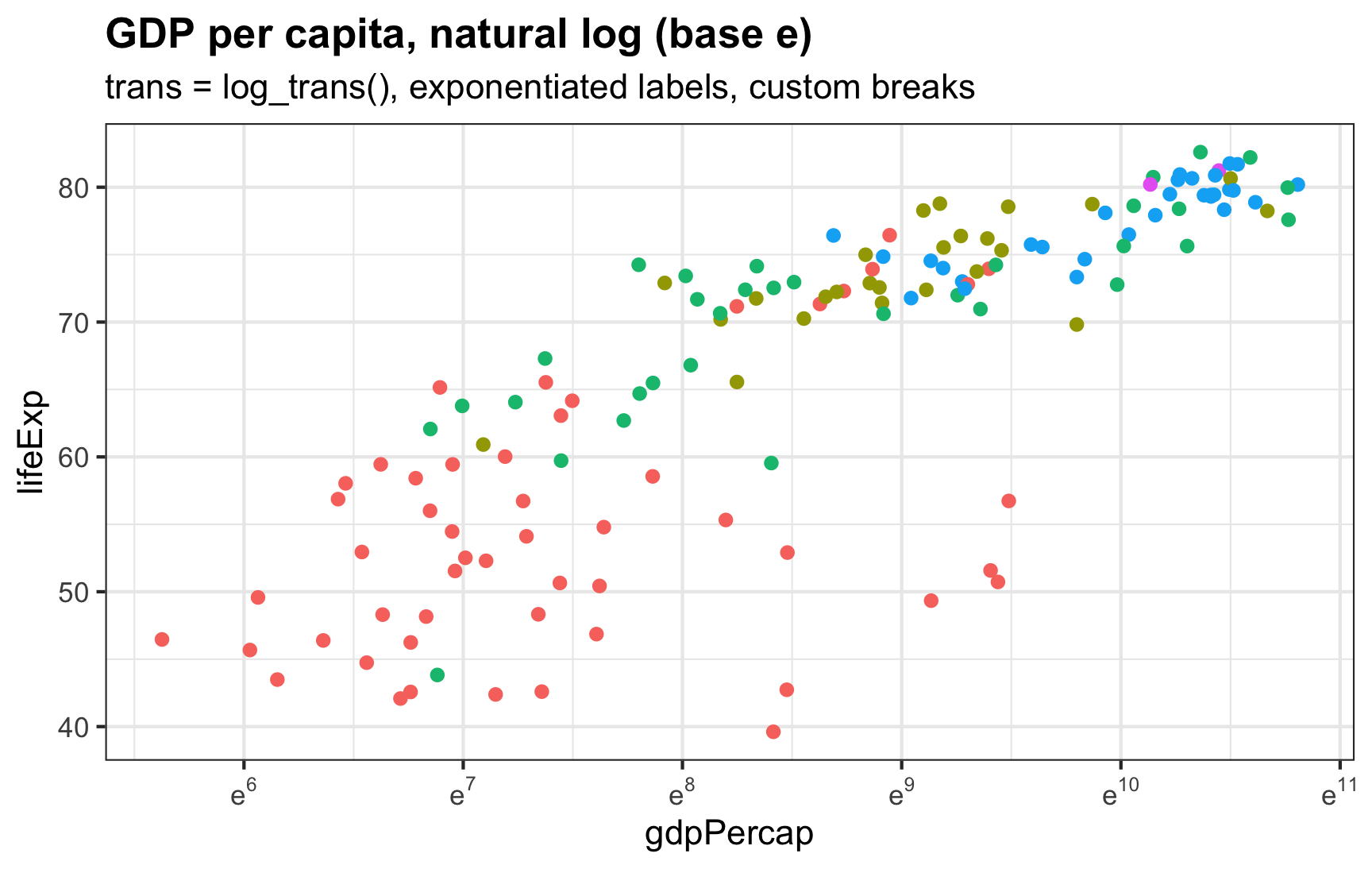
I always forget how to deal with logged values in ggplot—particularly things that use the natural log.
I always forget how to deal with logged values in ggplot—particularly things that use the natural log.
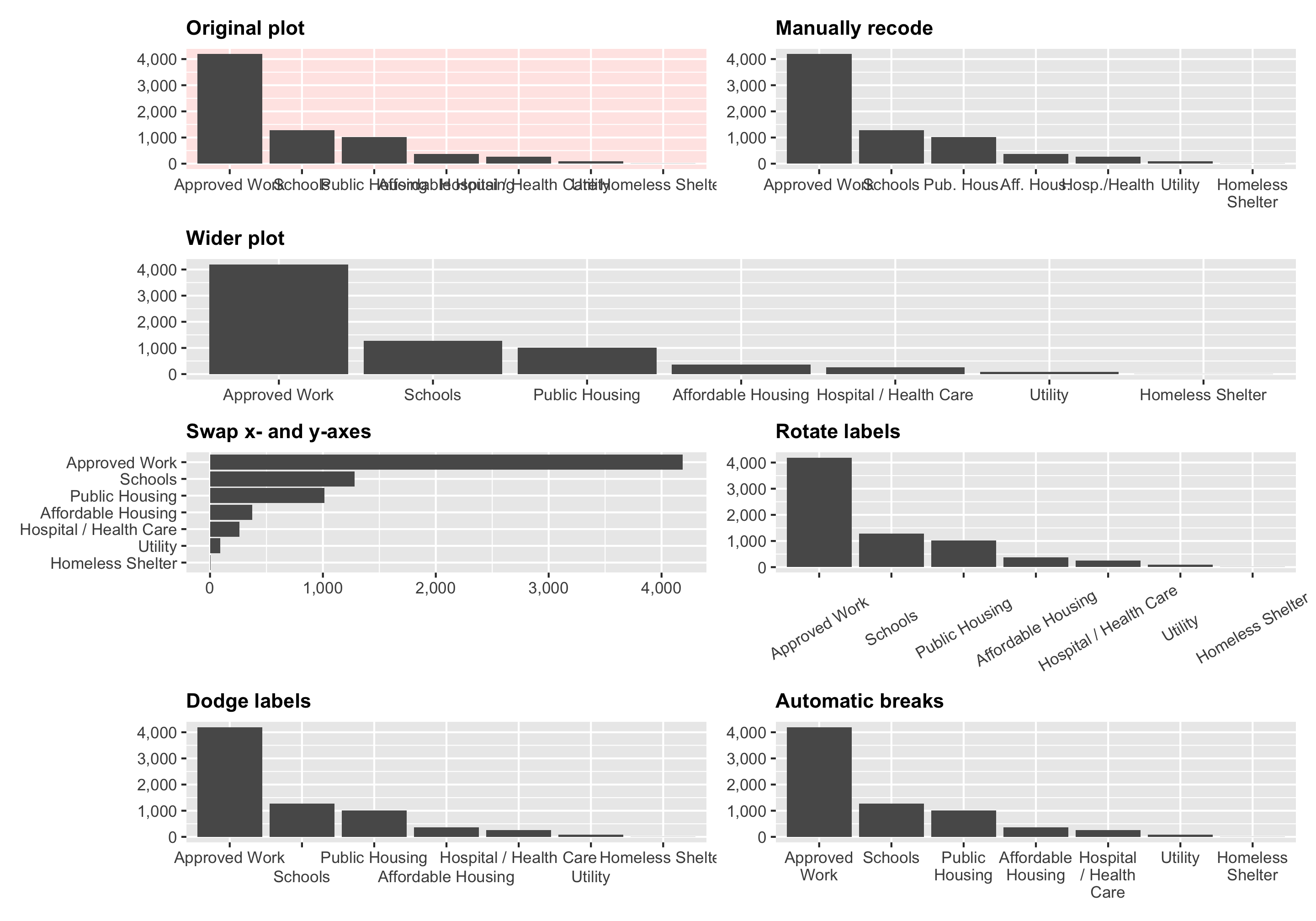
In one of the assignments for my data visualization class, I have students visualize the number of essential construction projects that were allowed to continue during New York City’s initial COVID shelter-in-place order in March and April 2020. It’s a good dataset to practice visualizing amounts and proportions and to practice with dplyr ’s group_by() and summarize() and shows some interesting trends.
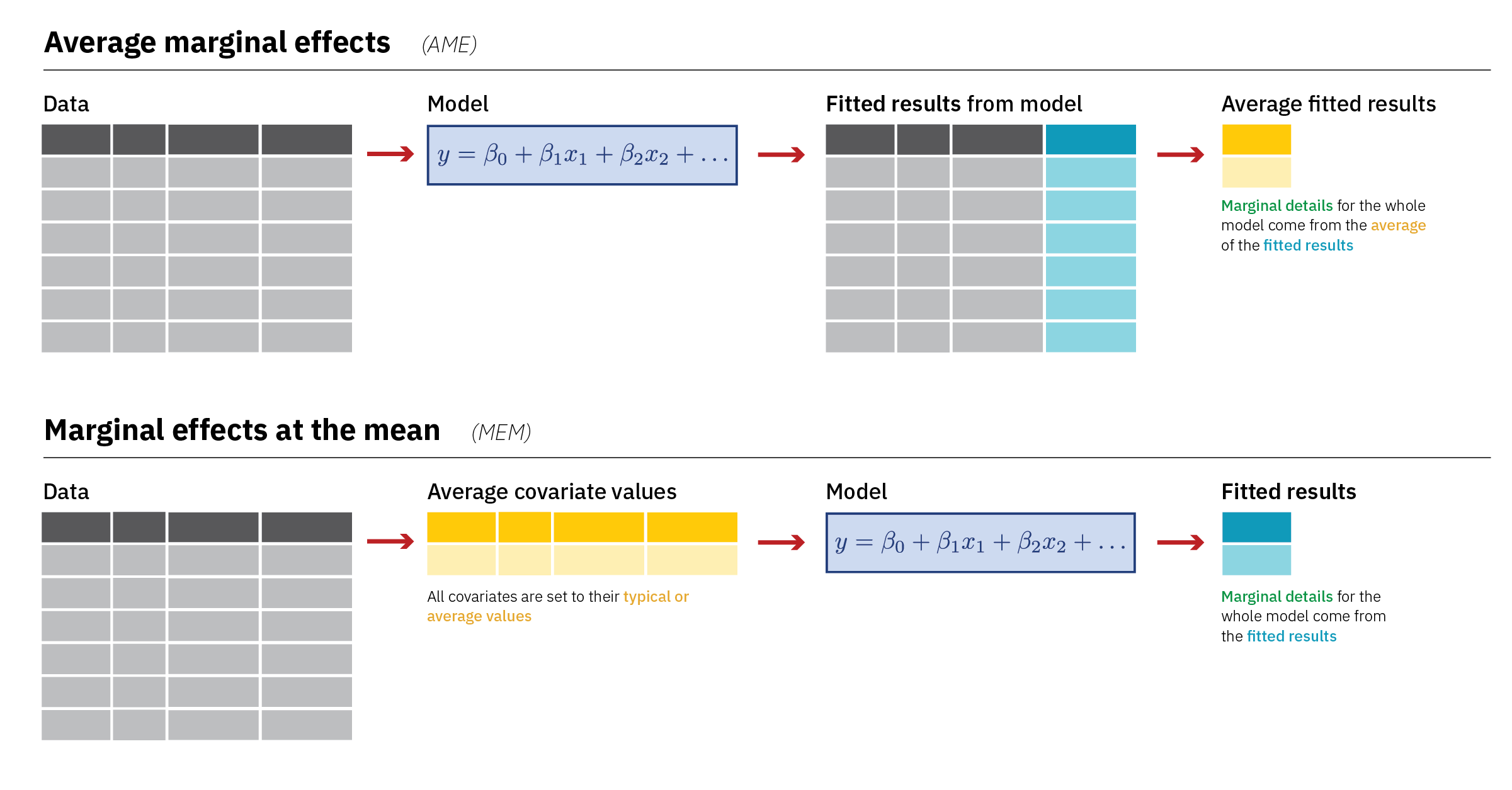
Diagrams! You can download PDF, SVG, and PNG versions of the marginal effects diagrams in this guide, as well as the original Adobe Illustrator file, here: PDFs, SVGs, and PNGs Illustrator .ai file Do whatever you want with them! They’re licensed under Creative Commons Attribution-ShareAlike (BY-SA 4.0). I’m a huge fan of doing research and analysis in public.
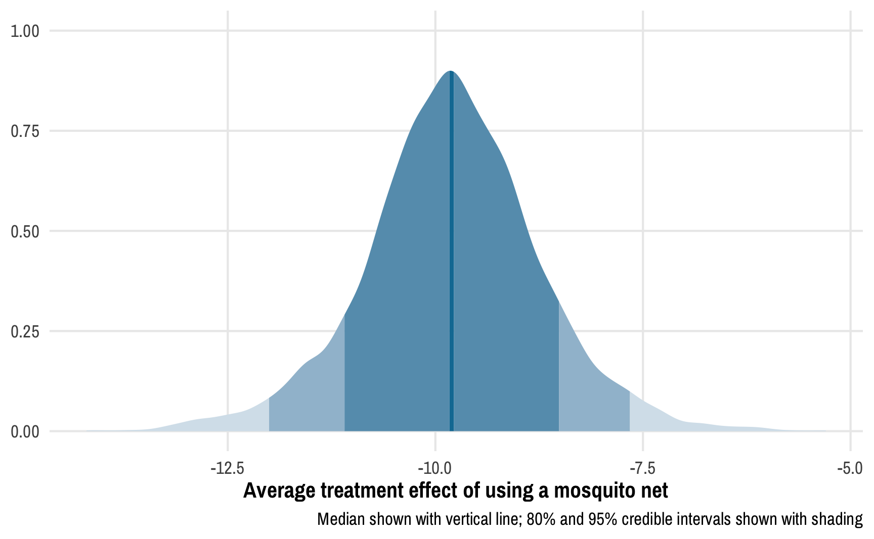
Read the previous post first! This post is a sequel to the previous one on Bayesian propensity scores and won’t make a lot of sense without reading that one first. Read that one first! In my previous post about how to create Bayesian propensity scores and how to legally use them in a second stage outcome model, I ended up using frequentist models for the outcome stage.
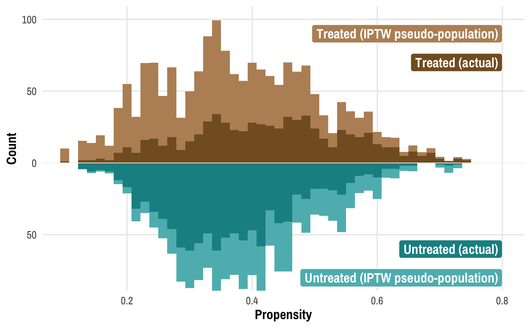
This post combines two of my long-standing interests: causal inference and Bayesian statistics. I’ve been teaching a course on program evaluation and causal inference for a couple years now and it has become one of my favorite classes ever.
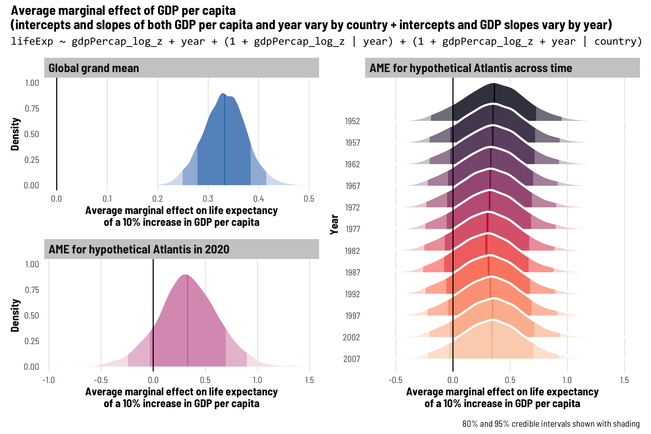
In most of my research, I work with country-level panel data where each row is a country in a specific year (Afghanistan in 2010, Afghanistan in 2011, and so on), also known as time-series cross-sectional (TSCS) data.
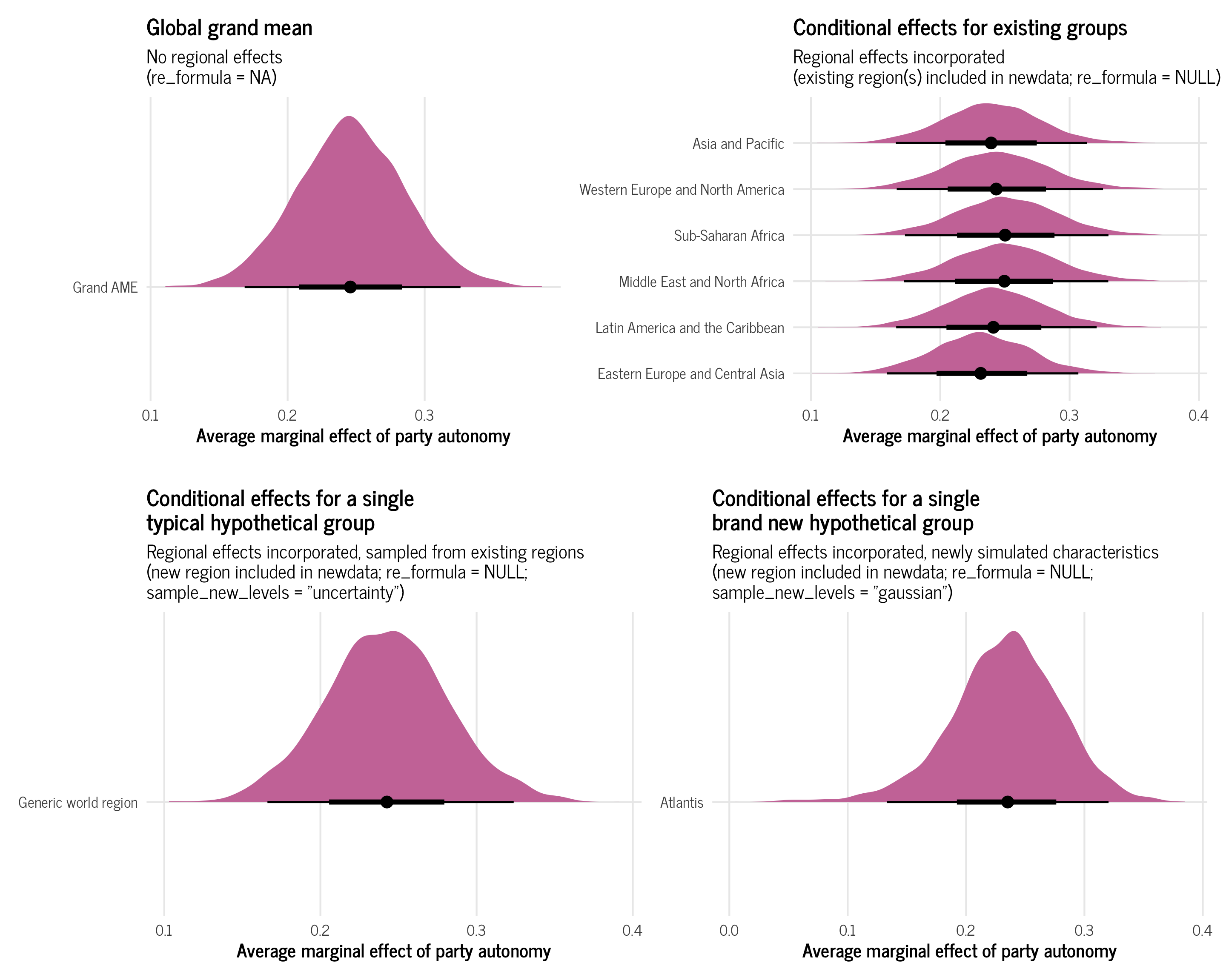
At the end of my previous post on beta and zero-inflated-beta regression, I included an example of a multilevel model that predicted the proportion of women members of parliament based on whether a country implements gender-based quotas for their legislatures, along with a few different control variables. I also included random effects for year and region in order to capture time- and geography-specific trends.
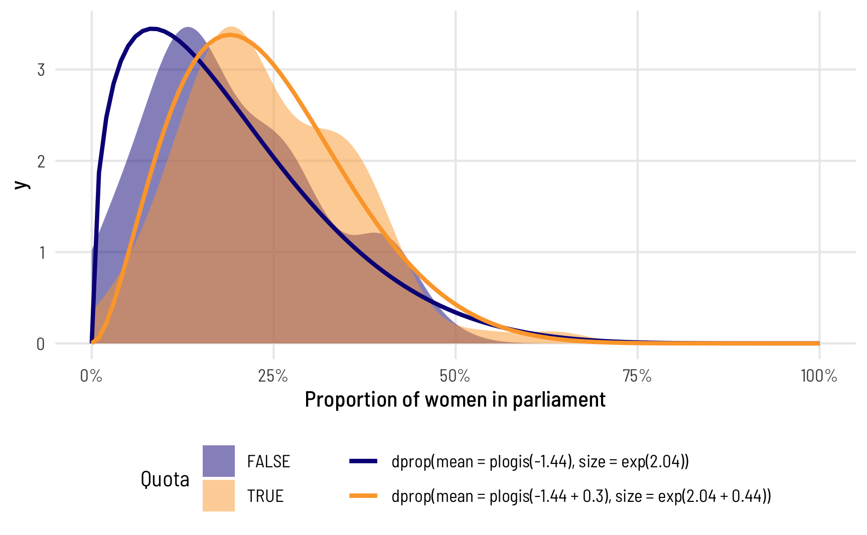
In the data I work with, it’s really common to come across data that’s measured as proportions: the percent of women in the public sector workforce, the amount of foreign aid a country receives as a percent of its GDP, the percent of religious organizations in a state’s nonprofit sector, and so on. When working with this kind of data as an outcome variable (or dependent variable) in a model, analysis gets tricky if you use standard models like
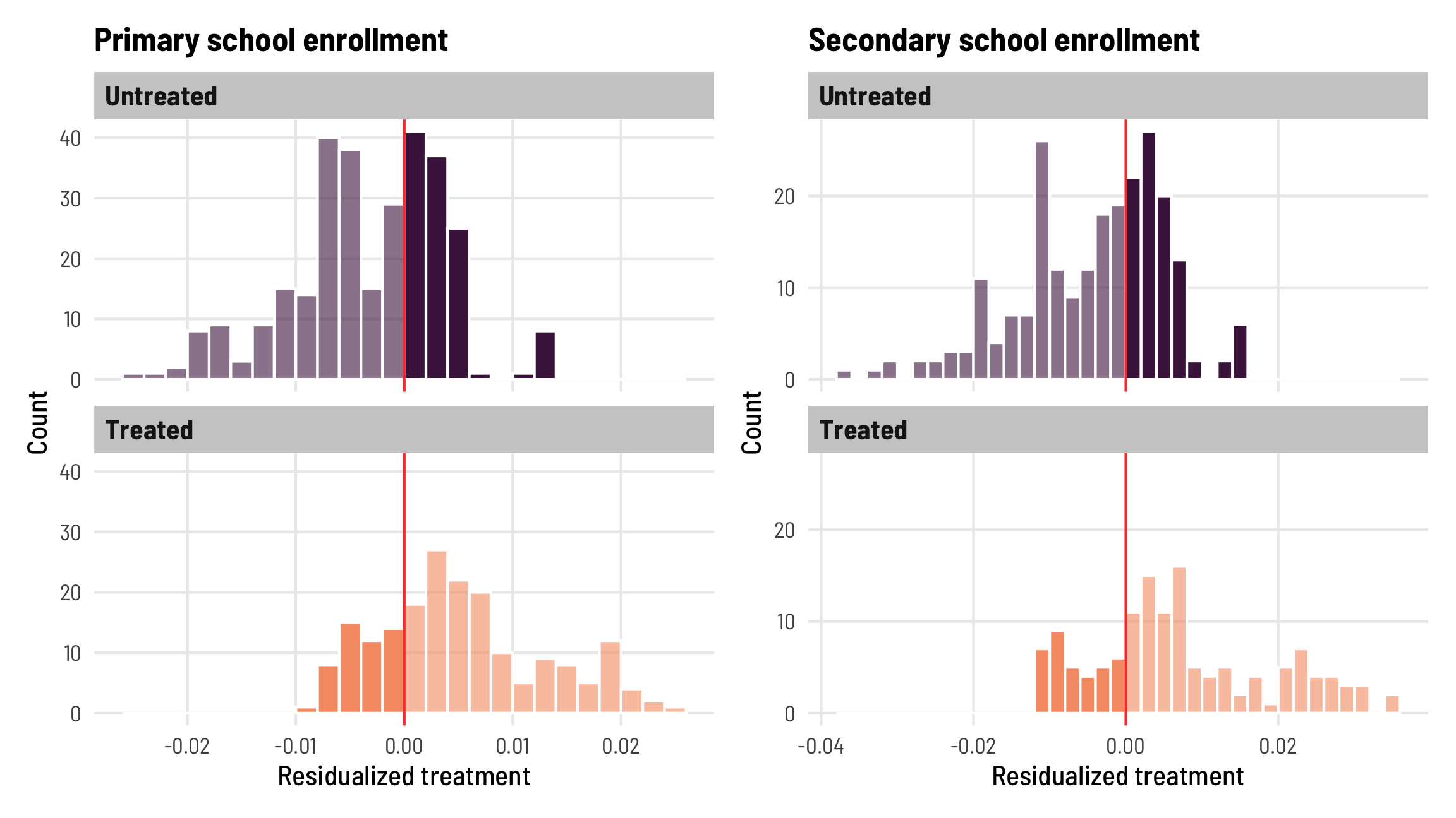
The world of econometrics has been roiled over the past couple years with a bunch of new papers showing how two-way fixed effects (TWFE; situations with nested levels of observations, like country-year, state-month, etc.) estimates of causal effects from difference-in-differences-based natural experiments can be biased when treatment is applied at different times.
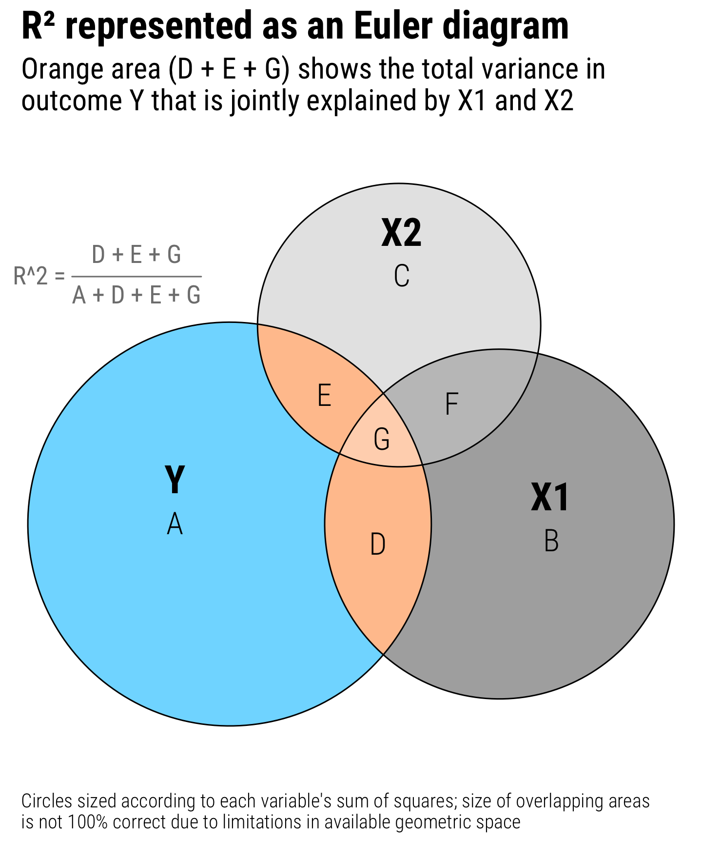
Regression is the core of my statistics and program evaluation/causal inference courses. As I’ve taught different stats classes, I’ve found that one of the regression diagnostic statistics that students really glom onto is . Unlike lots of regression diagnostics like AIC, BIC, and the joint F-statistic, has a really intuitive interpretation—it’s the percent of variation in the outcome variable explained by all the explanatory variables.