Publicaciones de Rogue Scholar

language
Publicado in dataand.me
Autor Mara Averick

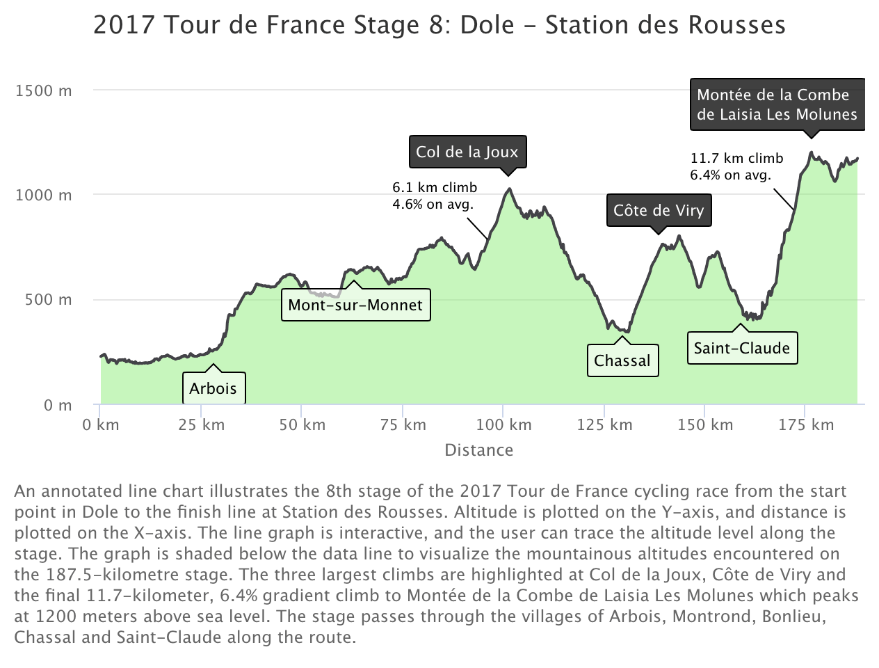
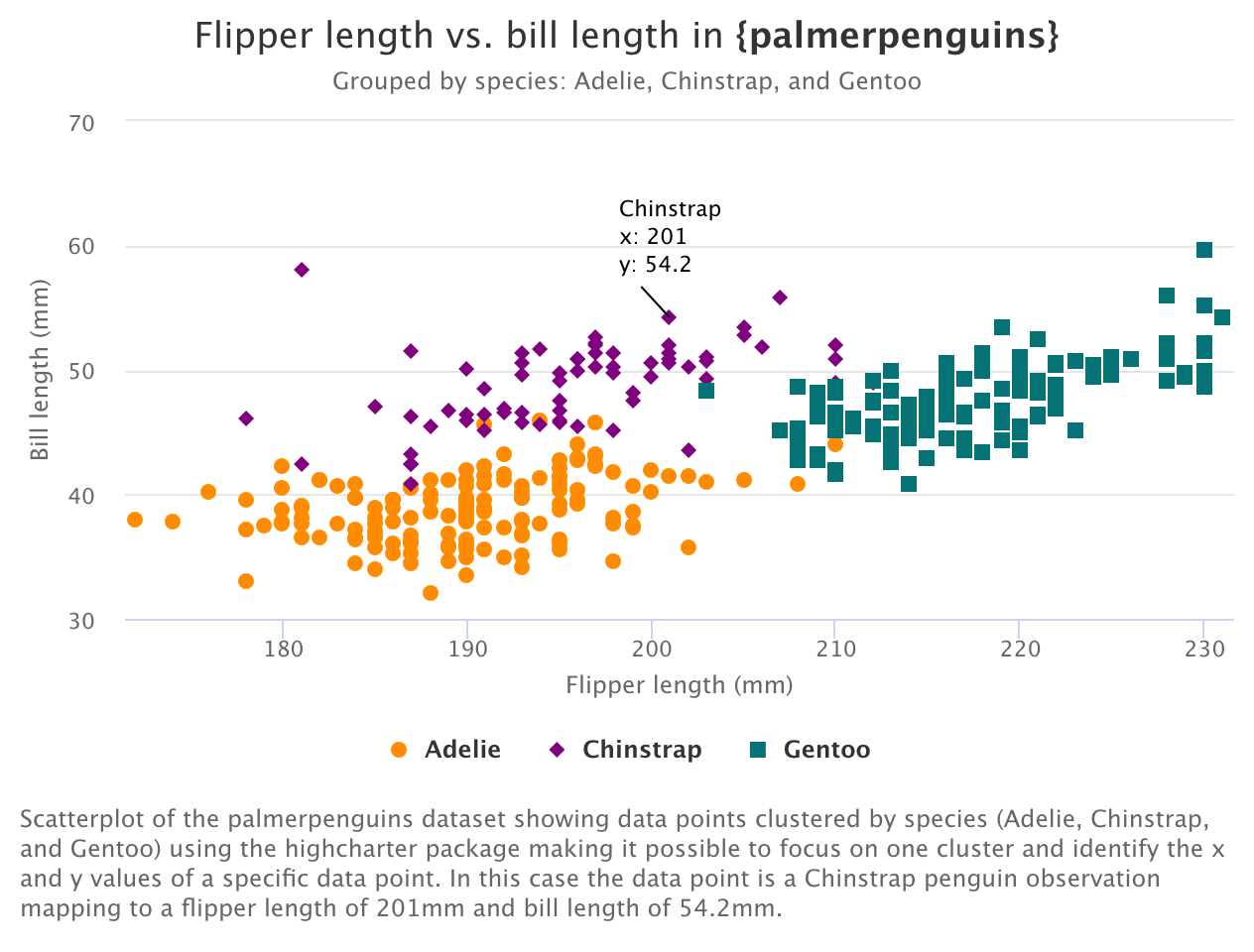
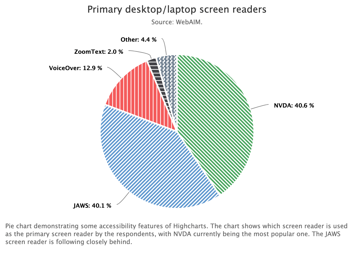
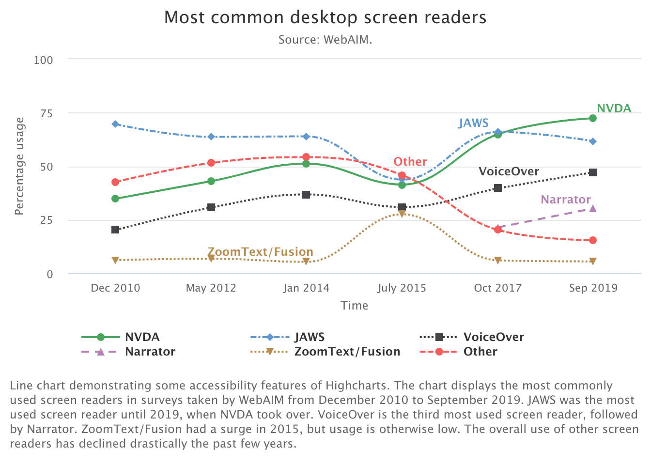
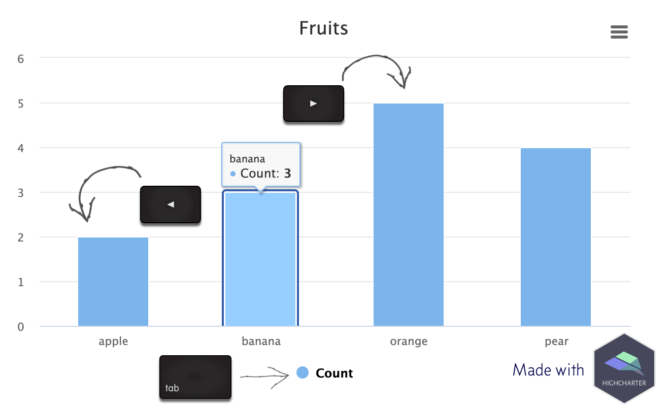
This final installment in our series on using the Highcharts accessibility module with {highcharter} is basically “extra credit.” (Read: I took the time to figure this out, so I’m sharing it. But, it’s probably not the most helpful post if you’re just trying to get the accessibility module working with {highcharter}.) We covered enabling the accessibility module, and getting basic keyboard navigation in part one.

Publicado in dataand.me
Autor Mara Averick

Back in the first post in this series I mentioned that the impetus for this whole endeavor was Silvia Canelón’s excellent collection of R-specific resources for making data visualizations more accessible (Canelón 2021). I wanted to fill the gap between the possibilities afforded by Highcharts’ accessibility module, and documented examples of module use with the {highcharter} package (Kunst 2021). Don’t worry, I have pull requests in the works

Publicado in dataand.me
Autor Mara Averick

In the first two parts of this series we introduced the Highcharts accessibility module, the {highcharter} R package, and created some working examples with accessibility features turned on. Here, we’ll follow in the vein as part 2 by re-creating one of the accessible chart demos from Highcharts.

Publicado in dataand.me
Autor Mara Averick

Today we’ll be using the Joshua Kunst’s {highcharter} package to re-create the first example from the Highcharts documentation for its accessibility module, an accessible line chart showing screen reader popularity over time, as an htmlwidget.

Publicado in Andrew Heiss's blog

At the end of my previous post on beta and zero-inflated-beta regression, I included an example of a multilevel model that predicted the proportion of women members of parliament based on whether a country implements gender-based quotas for their legislatures, along with a few different control variables. I also included random effects for year and region in order to capture time- and geography-specific trends.

Publicado in Andrew Heiss's blog

In the data I work with, it’s really common to come across data that’s measured as proportions: the percent of women in the public sector workforce, the amount of foreign aid a country receives as a percent of its GDP, the percent of religious organizations in a state’s nonprofit sector, and so on. When working with this kind of data as an outcome variable (or dependent variable) in a model, analysis gets tricky if you use standard models like

Publicado in Andrew Heiss's blog

The world of econometrics has been roiled over the past couple years with a bunch of new papers showing how two-way fixed effects (TWFE; situations with nested levels of observations, like country-year, state-month, etc.) estimates of causal effects from difference-in-differences-based natural experiments can be biased when treatment is applied at different times.

Publicado in Andrew Heiss's blog

Regression is the core of my statistics and program evaluation/causal inference courses. As I’ve taught different stats classes, I’ve found that one of the regression diagnostic statistics that students really glom onto is . Unlike lots of regression diagnostics like AIC, BIC, and the joint F-statistic, has a really intuitive interpretation—it’s the percent of variation in the outcome variable explained by all the explanatory variables.