Messaggi di Rogue Scholar

language
Pubblicato in Front Matter

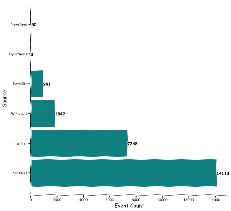
The Journal of Open Source Software (JOSS) is a developer friendly, open access journal for research software packages published as open source software. JOSS started publishing in 2016, and has published more than 1,500 articles so far. After five years and that many articles, it is time to have a closer look at how JOSS content is reused.

Pubblicato in Front Matter

One topic I will cover this Sunday in a presentation on Open Scholarship Tools at Wikimania 2014 together with Ian Mulvany is visualization. Data visualization is all about telling stories with data , something that is of course not only important for scholarly content, but for example increasingly common in journalism. This is a big and complex topic, but I hope the following will get you started.

Pubblicato in Front Matter

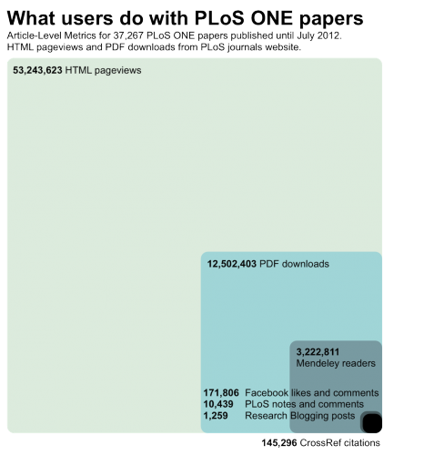
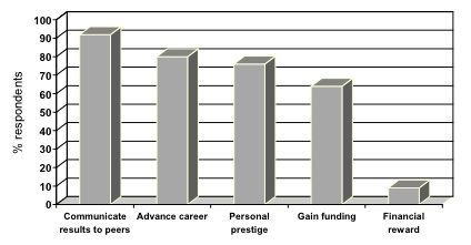
Inspired by four recent blog posts and their comments (Comments at journal websites: just turn them off, Open Access and The Dramatic Growth of PLoS ONE, No Comment?, If you email it, they will comment), I created a graphic to show what users do with PLoS ONE papers. As always, the data behind the graphic are openly available.

Pubblicato in Front Matter

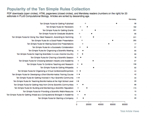
This has been another week working on visualizations. I have summarised some of the results in a blog post over at the PLoS API website. One of my current favorites is the dot chart. PLoS Computational Biology publishes a collection of Ten Simple Rules. The dot chart below summarizes the HTML pageviews, PDF downloads and Mendeley readers for this collection.

Pubblicato in Front Matter

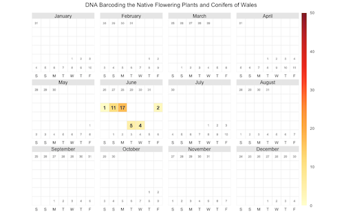
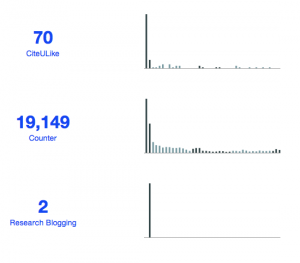
DNA Barcoding the Native Flowering Plants and Conifers of Wales has been one of the most popular new PLoS ONE papers in June. In the paper Natasha de Vere et al. describe a DNA barcode resource that covers the 1143 native Welsh flowering plants and conifers. My new job as technical lead for the PLoS Article Level Metrics (ALM) project involves thinking about how we can best display the ALM collected for this and other papers.

Pubblicato in Front Matter

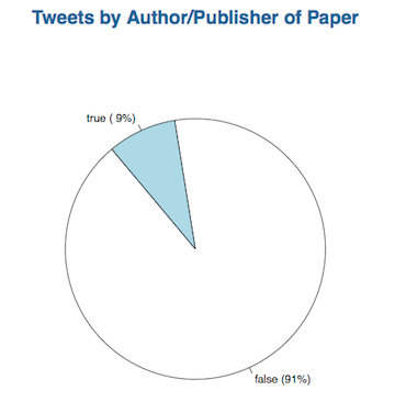
In December Euan Adie and I started the CrowdoMeter project, an analysis of the semantic content of tweets linking to scholarly papers. Because classifying almost 500 tweets is a lot of work, we turned this into a crowdsourcing project. We got help from 36 people, who did 953 classifications, and we discussed the preliminary results (available here) at the ScienceOnline2012 conference.

Pubblicato in Front Matter

In July Wiley published the book Visualize This – The Flowing Data Guide to Design, Visualization and Statistics . The book is written by Nathan Yau , and he is of course also behind the popular FlowingData blog about the same topic. This is a short review of the book. Please keep in mind that I’m no expert in data visualization.