Messaggi di Rogue Scholar

language
Pubblicato in quantixed

When preparing images for publication, it is good practice to check how accessible they are for colour blind people. Using a simple bit of code, it is possible to check an image – or a whole figure – in ImageJ for accessibility. For example, Figure 1 from our recent paper. Originally looked like this: Using the script we can see how it appears to people with different types of colour blindness.

Pubblicato in quantixed

A colleague said to me “Everyone is running on fumes with Easter being so late this year.” Really? Is it late? I admit to being completely perplexed by this religious date and its movement around the calendar. I always feel like I am the last to know when it is, let alone whether it is early or late. Let’s have a look at what constitutes an early or a late Easter. The data are available here. This is a quick post with no code example (sorry).

Pubblicato in Risk Taker!

Na publicação de hoje, quero trazer uma brincadeira que fiz comigo mesmo, um pequeno incentivo para voltar a publicar conteúdos sobre R (eu já estava enferrujado) entre outros assunto sobre economia. Passeando pelo instagram, encontrei um perfil que pública muita informação sobre economia em formato de visualização, o Economista Visual.

Pubblicato in quantixed

I’m a long-term fan of Weezer. Such was the brilliance of their first two albums that I have stuck with them through thick and thin. And dear me, there has been some very thin music. Nonetheless I own every album – thirteen of them. Among them are six albums entitled “Weezer”. These records are colloquially referred to by the colour of the album. In chronological order: blue, green, red, white, teal and black.

Pubblicato in quantixed

Our lab is international. People born all over the world have come to work in my group. I’m proud of this fact, especially in the current political climate. I’ve previously used the GoogleMaps API to display a heat map on our lab webpage. It shows where in the world people in the lab come from. This was OK, but I wanted to get an R based solution to make this graphic to make it easier to automate updates.

Pubblicato in Andrew Heiss's blog

I am so beyond thrilled to announce that I’ll be joining the Andrew Young School of Policy Studies at Georgia State University in Fall 2019 as an assistant professor in the Department of Public Management and Policy. I’ll be teaching classes in statistics/data science, economics, and nonprofit management in beautiful downtown Atlanta, and we’ll be moving back to the South. I am so so excited about this!

Pubblicato in quantixed

Another post using R and looking at Twitter data. As I was typing out a tweet, I had the feeling that my vocabulary is a bit limited. Papers I tweet about are either “great”, “awesome” or “interesting”. I wondered what my most frequently tweeted words are. Like the last post you can (probably) do what I’ll describe online somewhere, but why would you want to do that when you can DIY in R? First, I requested my tweets from Twitter.

Pubblicato in Bastian Greshake Tzovaras

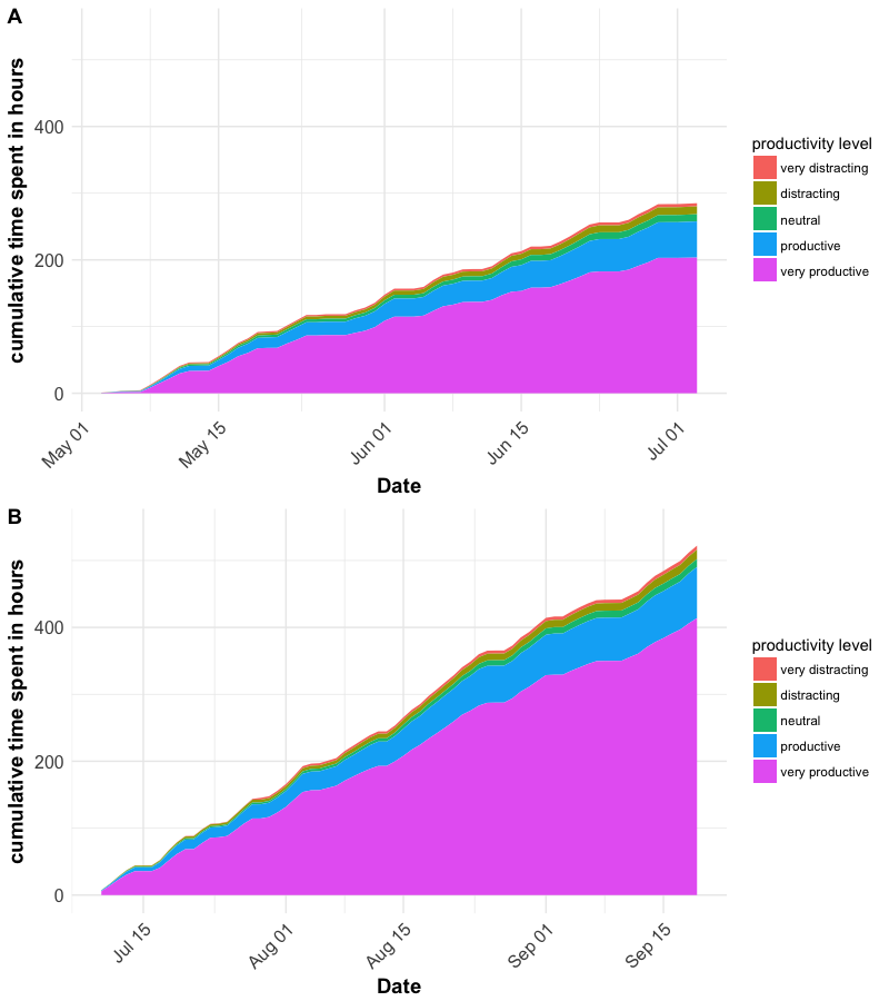
Today I finally submitted my PhD thesis (🎉) and what better way to celebrate that day than doing some data analysis and visualization, right? So, let’s get some idea on how much time the actual write-up took after all and how I spent my time during these weeks. Luckily, I’m running RescueTime on my machines. The service allows you to monitor how, when and how long you’re using your computer.

Pubblicato in quantixed

I use a Garmin 800 GPS device to log my cycling activity. including my commutes. Since I have now built up nearly 4 years of cycling the same route, I had a good dataset to look at how accurate the device is. I wrote some code to import all of the rides tagged with commute in rubiTrack 4 Pro (technical details are below). These tracks needed categorising so that they could be compared.