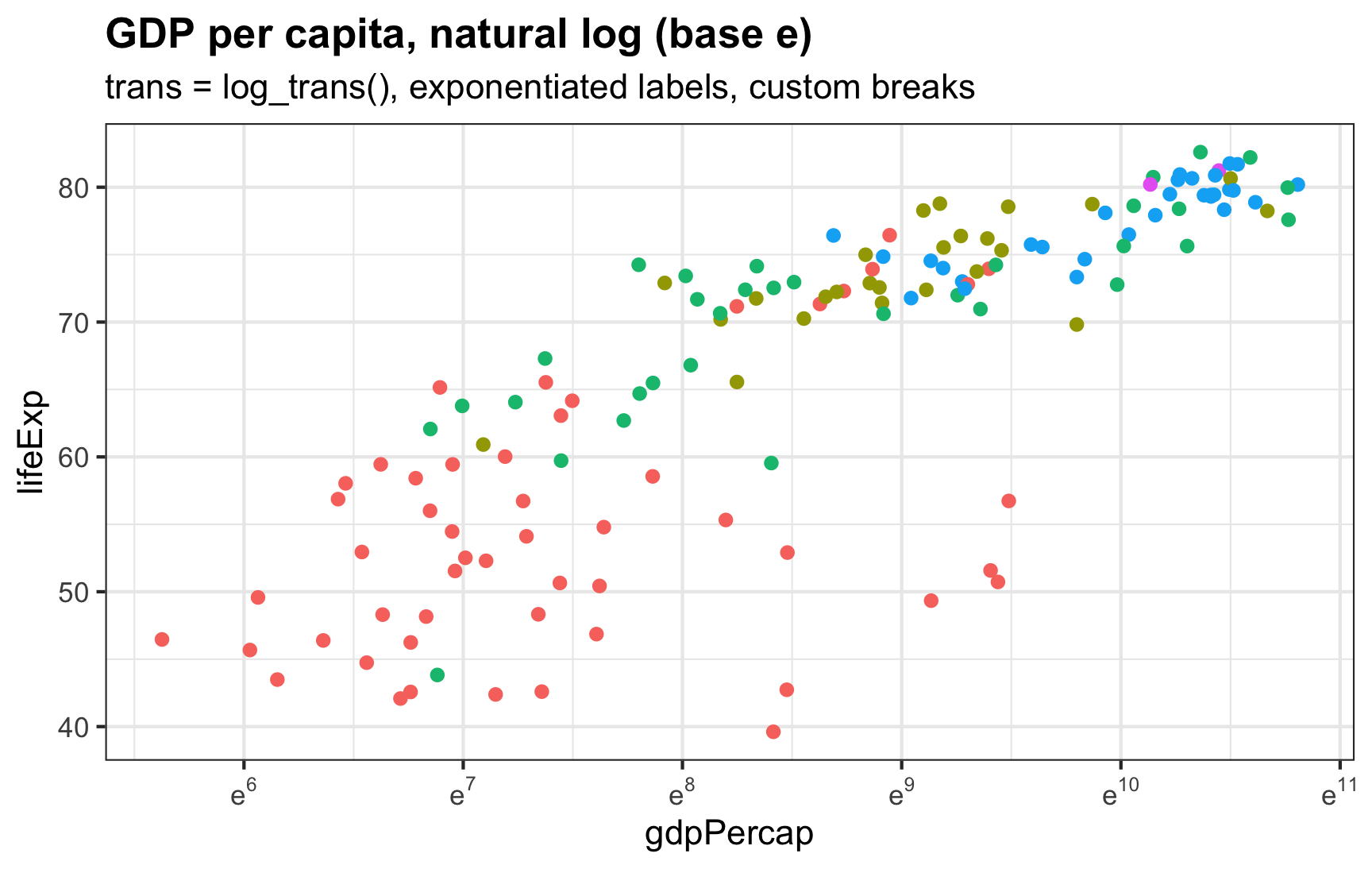
I always forget how to deal with logged values in ggplot—particularly things that use the natural log.

I always forget how to deal with logged values in ggplot—particularly things that use the natural log.

This post is about The Papermill Alarm: an API for detecting potential papermill-products. There’s a field of study called ‘stylometry’ where we look at the statistical properties of someone’s writing and use that to model their ‘style’. People write in idiosyncratic ways.
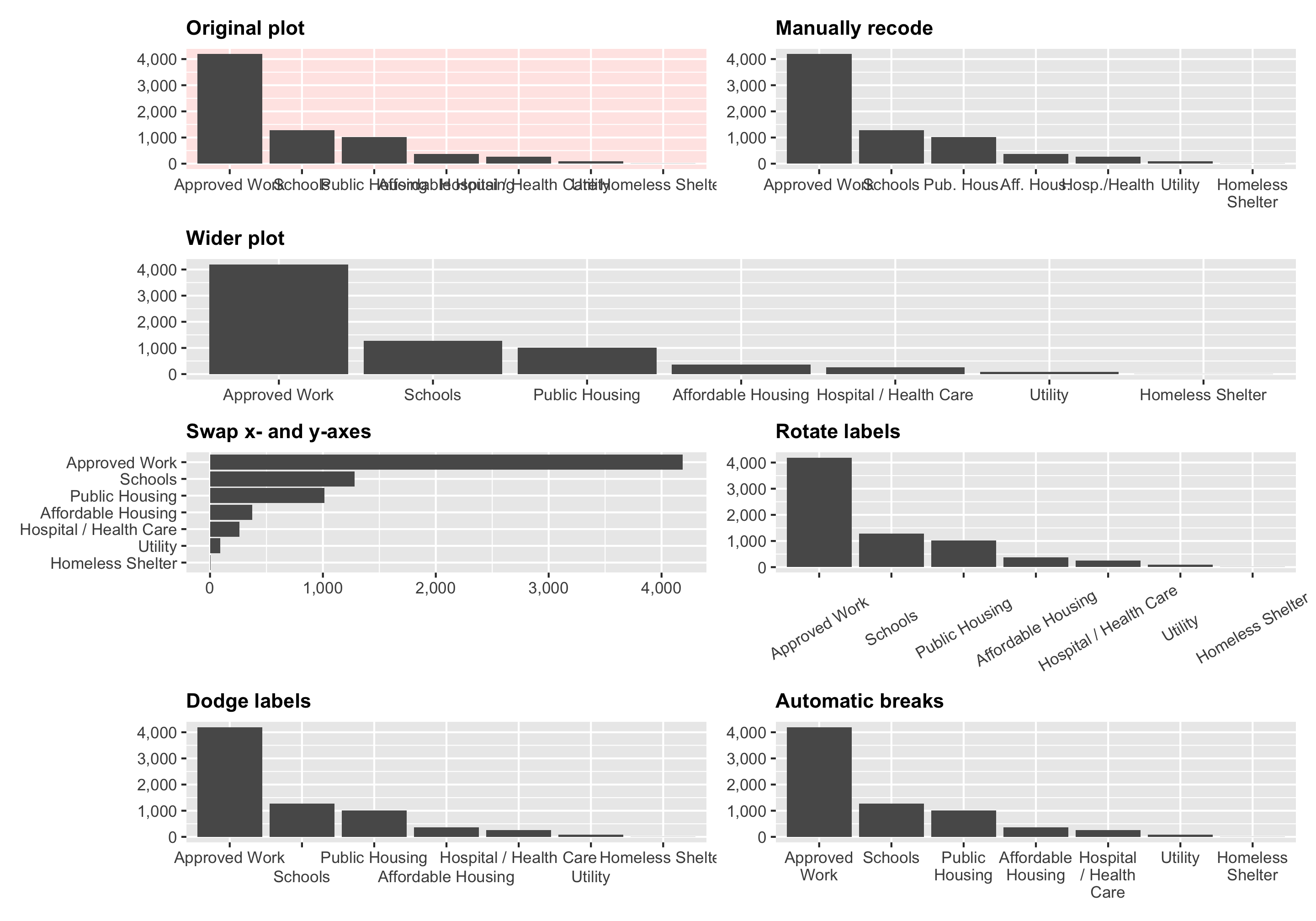
In one of the assignments for my data visualization class, I have students visualize the number of essential construction projects that were allowed to continue during New York City’s initial COVID shelter-in-place order in March and April 2020. It’s a good dataset to practice visualizing amounts and proportions and to practice with dplyr ’s group_by() and summarize() and shows some interesting trends.
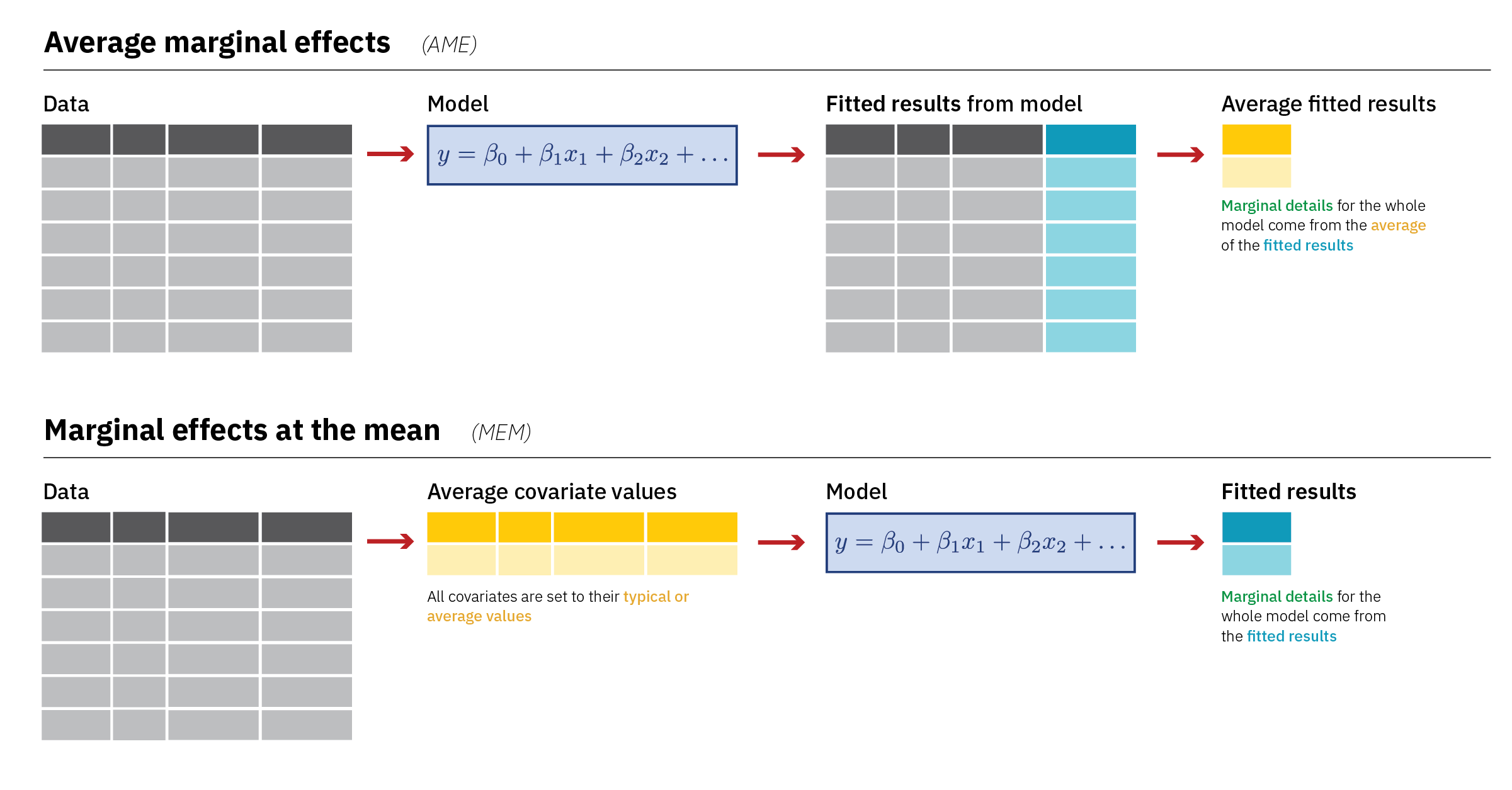
Diagrams! You can download PDF, SVG, and PNG versions of the marginal effects diagrams in this guide, as well as the original Adobe Illustrator file, here: PDFs, SVGs, and PNGs Illustrator .ai file Do whatever you want with them! They’re licensed under Creative Commons Attribution-ShareAlike (BY-SA 4.0). I’m a huge fan of doing research and analysis in public.

In my latest post for the Starschema blog, I discuss the end of dashboards, and what comes next: Read the full post here.
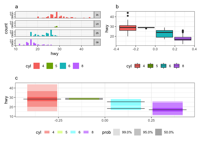
This was how being a newcomer to rOpenSci OzUnconf 2019 felt. It was incredible to be a part of such a diverse, welcoming and inclusive environment. I thought it would be fun to blog about how it all began, and the twists and turns we experienced along the way as we developed the gghdr package. The package provides tools for plotting highest density regions with ggplot2 and was inspired by the package hdrcde developed by Rob J Hyndman.
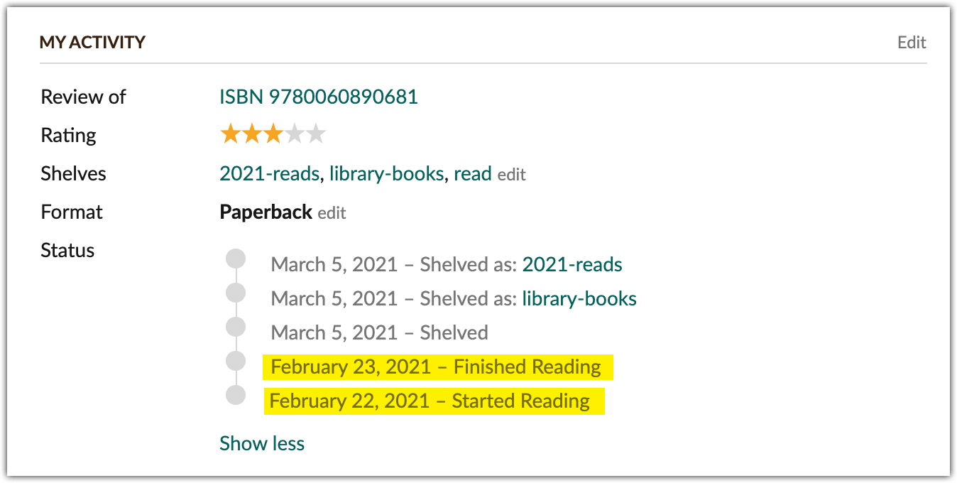
My relationship with reading borders on pathological (and by “borders on” I mean “has literally been a topic of discussion in therapy”). I mean, I’ve gotten it under control somewhat —we’ll use my 2014 Goodreads Reading Challenge as a bar for a bit out of control—which means I can take a look back on my 2021 year in books without too much self-recrimination.
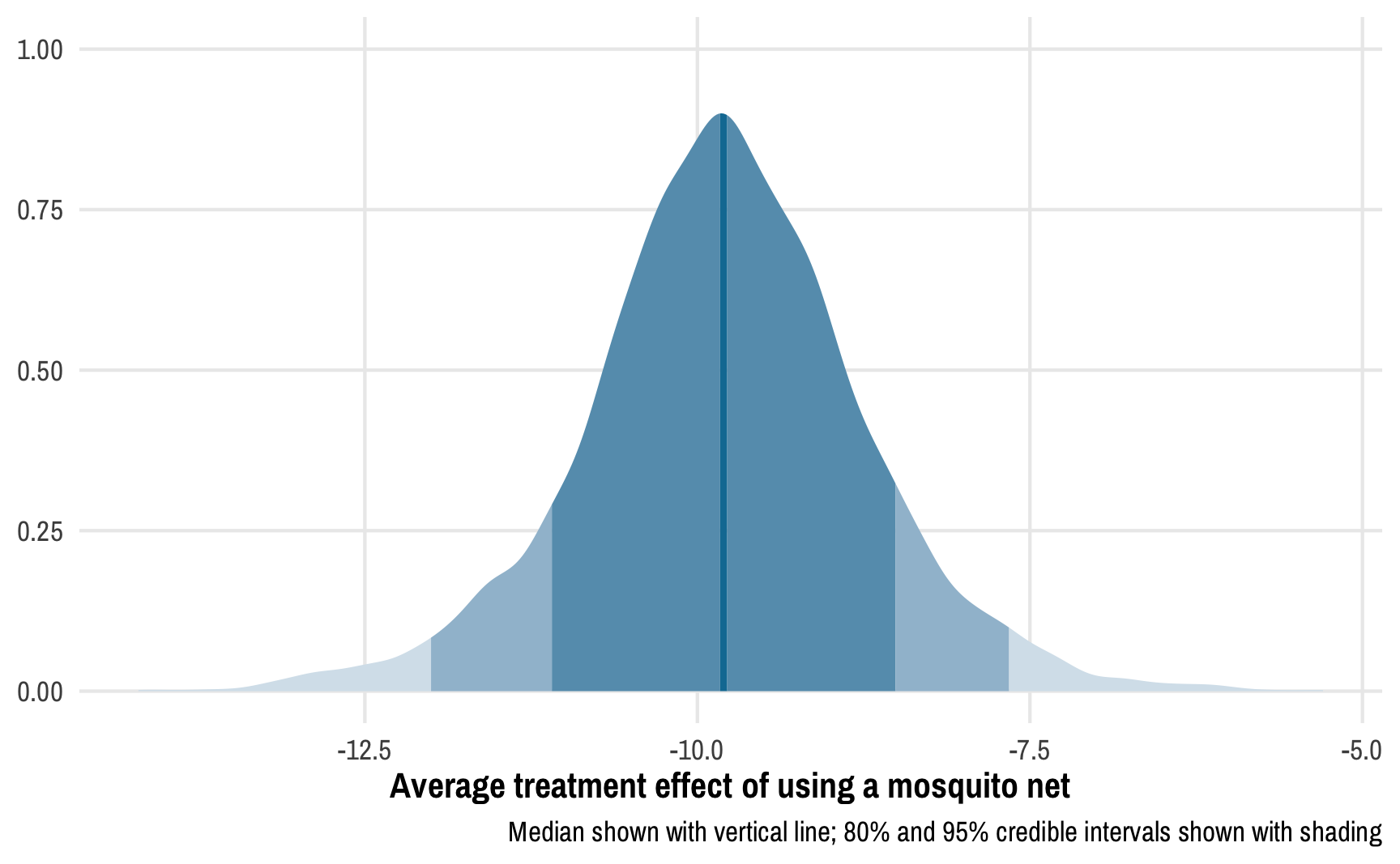
Read the previous post first! This post is a sequel to the previous one on Bayesian propensity scores and won’t make a lot of sense without reading that one first. Read that one first! In my previous post about how to create Bayesian propensity scores and how to legally use them in a second stage outcome model, I ended up using frequentist models for the outcome stage.
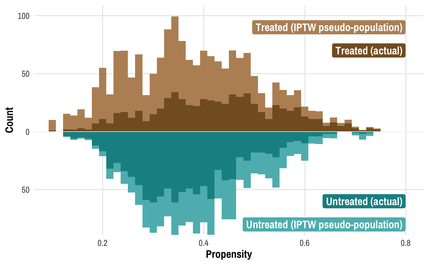
This post combines two of my long-standing interests: causal inference and Bayesian statistics. I’ve been teaching a course on program evaluation and causal inference for a couple years now and it has become one of my favorite classes ever.
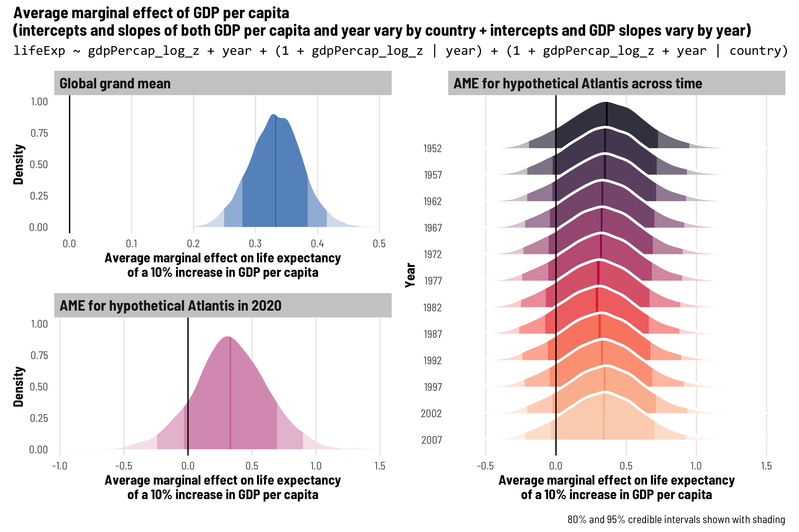
In most of my research, I work with country-level panel data where each row is a country in a specific year (Afghanistan in 2010, Afghanistan in 2011, and so on), also known as time-series cross-sectional (TSCS) data.