Pubblicato in Scholarly Communications Lab | ScholCommLab
Autore Alice Fleerackers

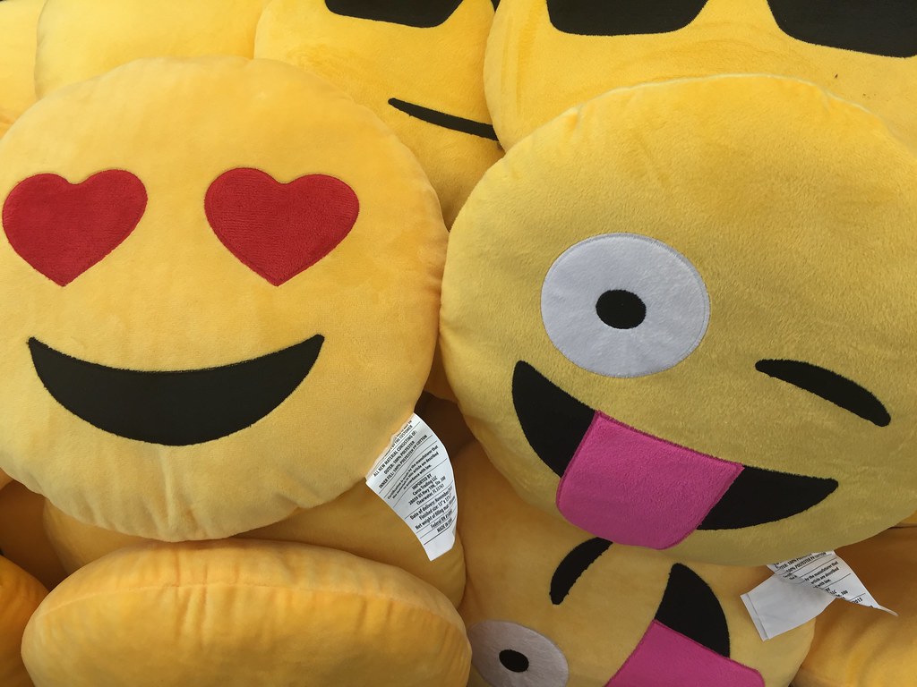
Do academics use emojis on Twitter? Stefanie Haustein analyzed more than 40 million tweets mentioning scientific journal articles, preprints, conference proceedings, and other documents to find out.
