
Creating and styling boxplots
Creators
Boxplots (also called box-and-whisker plots) are a graphical tool used to summarise and display the distribution of a continuous variable. They are useful for several reasons:
Identifying Outliers: Boxplots clearly highlight outliers (values that fall significantly outside the range of most of the data). Outliers are shown as individual points beyond the "whiskers" of the plot.
Visualizing the Spread and Central Tendency: The box itself shows the interquartile range (IQR). The line inside the box represents the median, providing a sense of central tendency.
Displaying the Range of Data: The boxplot gives a quick overview of the minimum, first quartile (Q1), median (Q2), third quartile (Q3), and maximum values, helping to understand the range and overall distribution.
Key Components of a Boxplot:
Box: Represents the interquartile range (IQR).
Whiskers: Extend to the smallest and largest data points within 1.5 times the IQR from Q1 and Q3.
Median: The line inside the box, representing the middle value of the dataset.
Outliers: Shown as individual points beyond the whiskers.
Boxplots provide a concise summary, making it easier to understand the distributional properties of a dataset at a glance.
In this tutorial, we demonstrate how to create boxplots using ggplot. We will use a dataset from a nutrition survey of school children 10 years and older from Pakistan. This dataset is available from the Oxford iHealth teaching datasets repository
## link to CSV from GitHub repository ----
1csv_file_url <- "https://raw.githubusercontent.com/OxfordIHTM/teaching_datasets/refs/heads/main/school_nutrition.csv"

## Read CSV file ----
2nut_data <- read.csv(file = csv_file_url)- 1
- This URL can be retrieved from GitHub by accessing the raw version of the GitHub link to the file
- 2
-
Use
read.csv()to read the CSV file from the URL
On inspection of the dataset, we see:
## Show first 5 rows of data ----
head(nut_data)
region school age_months sex weight height
1 1 1 121 2 20.6 124.6
2 1 1 121 1 27.9 130.7
3 1 1 129 2 25.7 131.4
4 1 1 133 1 27.0 135.7
5 1 1 145 2 28.5 130.5
6 1 1 148 2 35.1 142.1We have a data.frame with 267 rows and 6 columns.
For this tutorial, we will focus on the weight variable in the dataset for demonstrating how to create and style boxplots in base R.
Creating a boxplot
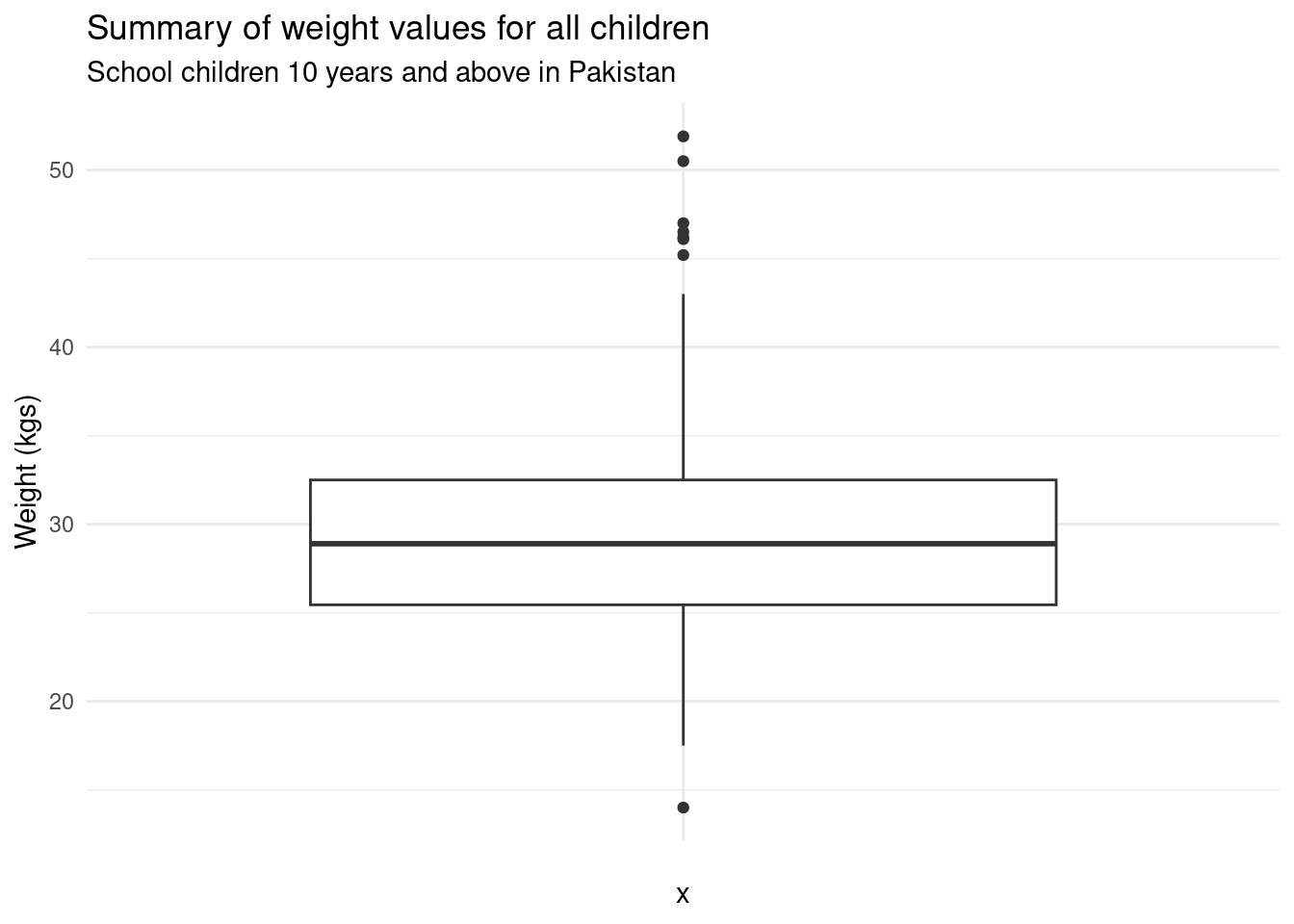
A boxplot of the weight variable for all children in the dataset can be created as follows:
## Load ggplot2 ----
1library(ggplot2)

## Boxplot of weight of all children ----
2ggplot(data = nut_data, mapping = aes(x = "", y = weight)) +
3  geom_boxplot() +
4  labs(
5    title = "Summary of weight values for all children",
6    subtitle = "School children 10 years and above in Pakistan",
7    y = "Weight (kgs)"
  ) +
8 theme_minimal()- 1
-
Load
{ggplot2}. If not yet installed, runinstall.packages("ggplot2"). - 2
-
Set
ggplotaesthetic mappings. For boxplot, we just need to set theyaxis value aesthetic and provide an empty characterxaxis value aesthetic so that the x-axis will be treated as a character value. For more information, run?ggplot. - 3
-
Plot the boxplot using
geom_boxplot(). For more information, run?geom_histogram. - 4
-
Set labels of the plot. For more information, run
?labs. - 5
-
Set the
titleof the plot. - 6
-
Set the
subtitleof the plot. - 7
-
Set the
yaxis label of the plot. - 8
-
Set a plot theme. For more information, run
?themes.
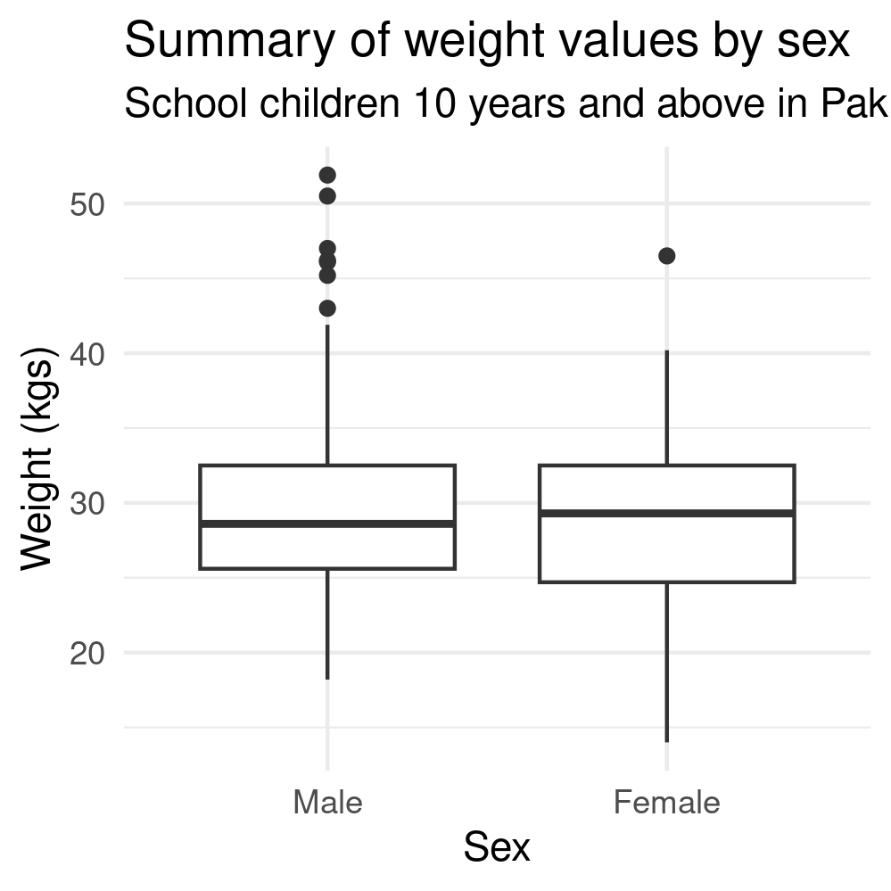
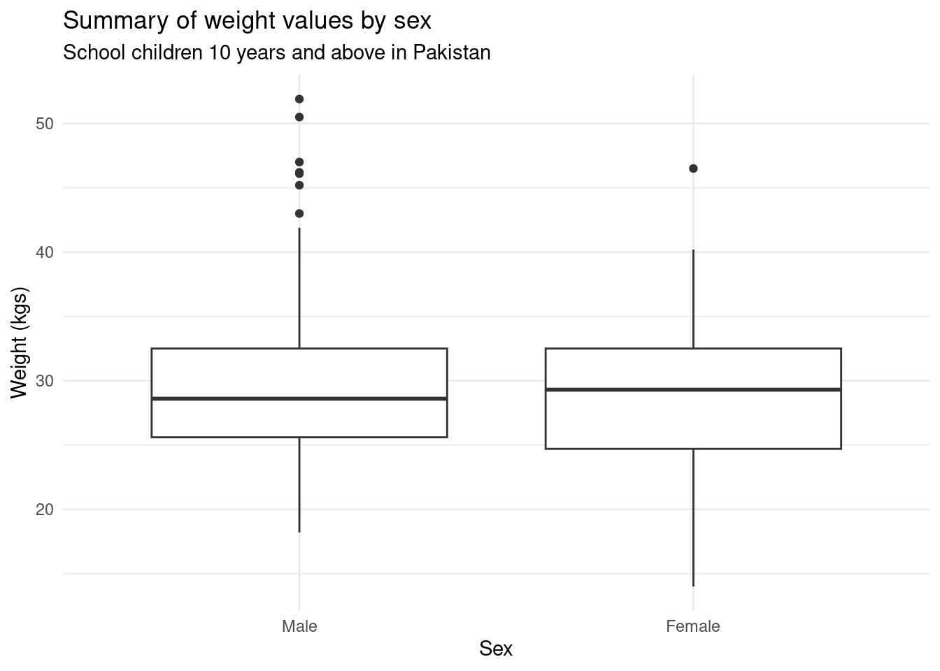
A boxplot for weight by sex is created as follows:
## Convert sex to factor ----
nut_data$sex <- factor(nut_data$sex, labels = c("Male", "Female"))

## Boxplot of weight by sex of children ----
1ggplot(data = nut_data, mapping = aes(x = sex, y = weight)) +
  geom_boxplot() +
  labs(
    title = "Summary of weight values by sex",
    subtitle = "School children 10 years and above in Pakistan",
    x = "Sex",
    y = "Weight (kgs)"
  ) +
theme_minimal()- 1
-
Set x-axis variable to
sex.
Additional details
Description
Boxplots (also called box-and-whisker plots) are a graphical tool used to summarise and display the distribution of a continuous variable. They are useful for several reasons: Identifying Outliers : Boxplots clearly highlight outliers (values that fall significantly outside the range of most of the data). Outliers are shown as individual points beyond the "whiskers" of the plot.
Identifiers
- UUID
- f4590f2c-7872-4995-8e43-333d47452c13
- GUID
- https://oxford-ihtm.io/posts/2023-11-29-boxplot-ggplot/
- URL
- https://oxford-ihtm.io/posts/2023-11-29-boxplot-ggplot/
Dates
- Issued
-
2023-11-29T01:00:00
- Updated
-
2023-11-29T01:00:00