
Data Visualization
Creators
Exploratory Data Analysis (EDA) is the crucial first step in the data
analysis process. Before applying complex statistical models or machine
learning algorithms, it is essential to understand the structure,
trends, and peculiarities of the data you are working with. In this
introductory section, we will explore the fundamental concepts of EDA
and its role in data analysis. EDA serves several purposes: Understanding Data: EDA helps us become familiar
with the dataset, identify the available variables, and understand their
nature (numeric, categorical, temporal, etc.). Detecting Patterns: EDA allows us to detect
patterns, relationships, and potential outliers within the data. This is
critical for making informed decisions during the analysis. Data Cleaning: Through EDA, we can identify
missing values, outliers, or data inconsistencies that require cleaning
and preprocessing. Feature Engineering: EDA may suggest feature
engineering opportunities, such as creating new variables or
transforming existing ones to better represent the underlying
data. Hypothesis Generation: EDA often leads to the
generation of hypotheses or research questions, guiding further
investigation. Communicating Insights: EDA produces
visualizations and summaries that facilitate the communication of
insights to stakeholders or team members. In the following sections, we will delve into the practical aspects
of EDA, starting with data simulation and visualization techniques. Before diving into Exploratory Data Analysis (EDA) on real datasets,
it's helpful to begin with the generation of simulated data. This allows
us to have full control over the data and create example scenarios to
understand key EDA concepts. In this section, we will learn how to
generate simulated datasets using R. To start, let's define some basic parameters that we'll use to
generate simulated data: We will use these parameters to generate sample data. Now, let's proceed to generate sample data based on the defined
parameters. In this example, we'll create a simple dataset with the
following variables: Here's the R code to create the sample dataset: This code creates a dataset With our simulated data ready, we can now move on to creating various
plots and performing EDA. In this section, we will explore various visualization techniques
that play a crucial role in Exploratory Data Analysis (EDA).
Visualizations help us gain insights into the data's distribution,
patterns, and relationships between variables. We will use the simulated
dataset generated in the previous section to illustrate these
techniques. The choice of visualization depends on the nature of your data and
the specific aspects you want to highlight. Generally, in EDA, we often
need to: Examine Changes Over Time: Use time series plots
when you want to assess changes in one or more variables over
time. Check for Data Distribution: Create distribution
plots, such as histograms and density plots, to understand how data
points are distributed. Explore Variable Relationships: Employ
correlation plots and scatter plots to identify linear relationships
between variables. Let's start by examining these aspects one by one using our simulated
dataset. To explore changes over time, we'll create a time series plot for the
In this code, we use To check the data distribution, we'll create histogram plots for each
of the variables: These plots will help us understand the distribution characteristics
of our variables. Correlation plots allow us to examine relationships between
variables. We'll create scatter plots for pairs of variables to assess
their linear correlation. Here's an example for
These scatter plots help us identify whether variables exhibit linear
correlation. In the following sections, we'll delve deeper into each of these plot
types, interpret the results, and explore additional visualization
techniques for EDA. Box plots, also known as box-and-whisker plots, provide a summary of
the data's distribution, including median, quartiles, and potential
outliers. They are particularly useful for comparing the distributions
of different variables or groups. Here's an example of creating box
plots for Box plots can reveal variations and central tendencies of the
variables. Pair plots, or scatterplot matrices, allow us to visualize pairwise
relationships between multiple variables in a dataset. They are helpful
for identifying correlations and patterns among variables
simultaneously. Here's how to create a pair plot for our dataset: Pair plots provide a comprehensive view of variable interactions. Time series data often contain underlying components such as trends
and seasonality that can be crucial for understanding the data's
behavior. Time series decomposition is a technique used in Exploratory
Data Analysis (EDA) to separate these components. In this section, we'll
demonstrate how to perform time series decomposition using our simulated
The code above performs the following: Decomposes the Plots the decomposed components, including the original time
series, trend, seasonal component, and residual. The resulting plot will show the individual components of the time
series, allowing us to gain insights into its underlying patterns. Interactive plots, created using libraries like
In this initial section, we've introduced the fundamental concepts of
exploratory data analysis (EDA) and the importance of data visualization
in gaining insights from complex datasets. We've explored various types
of plots and their applications in EDA. Now, let's dive deeper and enhance our understanding by demonstrating
practical examples of EDA using real-world datasets. We'll showcase how
different types of plots and interactive visualizations can provide
valuable insights and drive data-driven decisions. Let's embark on this EDA journey and uncover the hidden stories
within our data through hands-on examples. In this section, we'll dive into a meaningful example of time series
decomposition to demonstrate its practical utility in Exploratory Data
Analysis (EDA). Time series decomposition allows us to extract valuable
insights from time-dependent data. We'll use our simulated
Imagine we have daily temperature data for a city over several years.
We want to understand the underlying patterns in temperature variations,
including trends and seasonality, to make informed decisions related to
weather forecasts, climate monitoring, or energy management. Let's create the enhanced dataset with temperature data for multiple
cities. We'll use the We've generated temperature data for each city over the span of ten
years, resulting in a diverse and complex dataset. Now that we have our multi-city temperature dataset, let's apply time
series decomposition to analyze temperature trends and seasonality for
one of the cities, such as New York (see plot) The plot will display the components of the time series for New York,
including the original time series, trend, seasonal component, and
residual. Similar analyses can be performed for other cities to identify
regional temperature patterns. With our enhanced multi-city temperature dataset and time series
decomposition, we can: Regional Analysis: Compare temperature patterns
across different cities to identify regional variations. Seasonal Insights: Understand how temperature
seasonality differs between cities and regions. Long-Term Trends: Analyze temperature trends for
each city over the ten-year period. This advanced analysis helps us make informed decisions related to
climate monitoring, urban planning, and resource management. In this section, we'll illustrate the significance of distribution
plots in Exploratory Data Analysis (EDA) by considering a practical
scenario. Distribution plots help us understand how data points are
distributed and can reveal insights about the underlying data
characteristics. We'll use our simulated dataset and focus on the
Imagine we have a dataset containing exam scores of students in a
class. We want to gain insights into the distribution of exam scores to
answer questions like: What is the typical exam score? Are the exam scores normally distributed? Are there any outliers or unusual patterns in the
scores? Let's create a histogram to visualize the distribution of exam scores
using the The resulting histogram will display the distribution of exam scores.
Here's what we can interpret: Typical Exam Score: The histogram will show
where the majority of exam scores lie, indicating the typical or central
value. Distribution Shape: We can assess whether the
scores follow a normal distribution, are skewed, or have other unique
characteristics. Outliers: Outliers, if present, will appear as
data points far from the central part of the distribution. By analyzing the distribution of exam scores, we can: Identify Central Tendency: Determine the typical
exam score, which can be useful for setting benchmarks or evaluating
student performance. Understand Data Characteristics: Gain insights
into the shape of the distribution, which informs us about the data's
characteristics. Detect Outliers: Identify outliers or unusual
scores that may require further investigation. In this section, we'll explore advanced correlation analysis using
more complex datasets. We'll create two datasets: one representing
students' academic performance, and the other containing information
about their study habits and extracurricular activities. We'll
investigate correlations between various factors to gain deeper
insights. Let's create the two complex datasets for our correlation
analysis: Academic Performance Dataset: Study Habits and Activities Dataset: Now that we have our complex datasets, let's perform advanced
correlation analysis to explore relationships between academic
performance, study habits, and extracurricular activities. We'll
calculate correlations and visualize them using a heatmap: The resulting heatmap visually represents the correlations between
academic performance and study-related factors. Here's what we can
interpret: Color Intensity: The color intensity indicates
the strength and direction of the correlation. Positive correlations are
shown in blue, while negative correlations are in red. The darker the
color, the stronger the correlation. Correlation Coefficients: The heatmap displays
the actual correlation coefficients as labels in the lower triangle.
These values range from -1 (perfect negative correlation) to 1 (perfect
positive correlation), with 0 indicating no correlation. By conducting advanced correlation analysis, we can: Understand Complex Relationships: Explore
intricate correlations between academic performance, study hours,
extracurricular activities, and stress levels. Identify Key Factors: Determine which factors
have the most significant impact on academic performance. Optimize Student Support: Use insights to
provide targeted support and interventions for students. Advanced correlation analysis helps us uncover nuanced relationships
within complex datasets. In this section, we'll explore the versatility of box plots by
working with diverse and complex datasets. We'll create two datasets:
one representing the distribution of monthly sales for multiple product
categories, and the other containing information about customer
demographics. These datasets will allow us to visualize various types of
distributions and identify outliers. Let's create the two complex datasets for our box plot analysis: Sales Dataset and Customer Demographics Dataset: These box plots help us gain insights into diverse distributions: Sales Distribution: We can observe how sales are
distributed across different product categories, identifying variations
and potential outliers. Customer Age Distribution: The box plot displays
the spread of customer ages, highlighting the central tendency and any
potential outliers. By using box plots with complex datasets, we can: Analyze Diverse Distributions: Visualize and
compare distributions of sales for multiple product categories and
customer age distributions. Outlier Detection: Identify potential outliers
in both sales data and customer demographics. Segmentation Insights: Understand how sales vary
across product categories and the age distribution of
customers. Box plots are versatile tools for exploring various types of data
distributions and making data-driven decisions. Suppose we have a dataset containing monthly stock prices for three
companies: Company A, Company B, and Company C. We want to create an
interactive time series plot that allows users to: Select the company they want to visualize. Zoom in and out to explore specific time periods. Hover over data points to view detailed information. The interactive time series plot created with Plotly offers the
following interaction features: Selection: Users can click on the legend to
select/deselect specific companies for visualization. Zoom: Users can click and drag to zoom in on a
specific time period. Hover Information: Hovering the mouse pointer
over data points displays detailed information about the selected data
point. Interactive visualizations with Plotly are valuable for: Exploration: Users can interactively explore
complex datasets and focus on specific aspects of the data. Data Communication: Presenting data in an
interactive format enhances communication and engagement. Decision Support: Interactive plots can be used
in decision-making processes where users need to explore data
dynamics. Interactive data visualizations are a powerful tool for EDA and data
presentation. In the next section, we'll explore another advanced
visualization technique: time series decomposition. The interactive time series plot created with Plotly offers the
following interaction features: Selection: Users can click on the legend to
select/deselect specific companies for visualization. Zoom: Users can click and drag to zoom in on a
specific time period. Hover Information: Hovering the mouse pointer
over data points displays detailed information about the selected data
point. Interactive visualizations with Plotly are valuable for: Exploration: Users can interactively explore
complex datasets and focus on specific aspects of the data. Data Communication: Presenting data in an
interactive format enhances communication and engagement. Decision Support: Interactive plots can be used
in decision-making processes where users need to explore data
dynamics. [Wickham
(2016)](Schloerke et
al. 2021)Introduction to Exploratory Data Analysis
(EDA)
Importance of
EDA
Generating Simulated
Data
Parameters and
Variables
x_min: The minimum value for the
variable x.x_max: The maximum value for the
variable x.x_step: The increment between
successive x values.y_mean: The mean value for the
dependent variable y.y_sd: The standard deviation for
the dependent variable y.y_min: The minimum possible value
for y.y_max: The maximum possible value
for y.
x: A sequence of values ranging
from x_min to
x_max with an increment of
x_step.var_random: A random variable with
values uniformly distributed between y_min
and y_max.var_norm: A variable with values
generated from a normal distribution with mean
y_mean and standard deviation
y_sd.var_sin: A variable with values
generated as the sine function of
x.library(data.table)
# Parameters
x_min <- 0
x_max <- 10
x_step <- 0.01
y_mean <- 0.5
y_sd <- 0.25
y_min <- -1
y_max <- 1
x <- seq(x_min, x_max, x_step)
# Variables
var_random <- runif(length(x), y_min, y_max)
var_norm <- rnorm(length(x), y_mean, y_sd)
var_sin <- sin(x)
# Data.frame
df <- data.frame(x, var_random, var_norm, var_sin)
dt <- data.table(df)
# Melt
dtm <- melt(dt, id.vars="x")df and a
data.table dt containing the generated
variables. The melt function from the
data.table library is used to reshape the
data for visualization purposes.Choosing the Right
Plot
Time
Series Plots
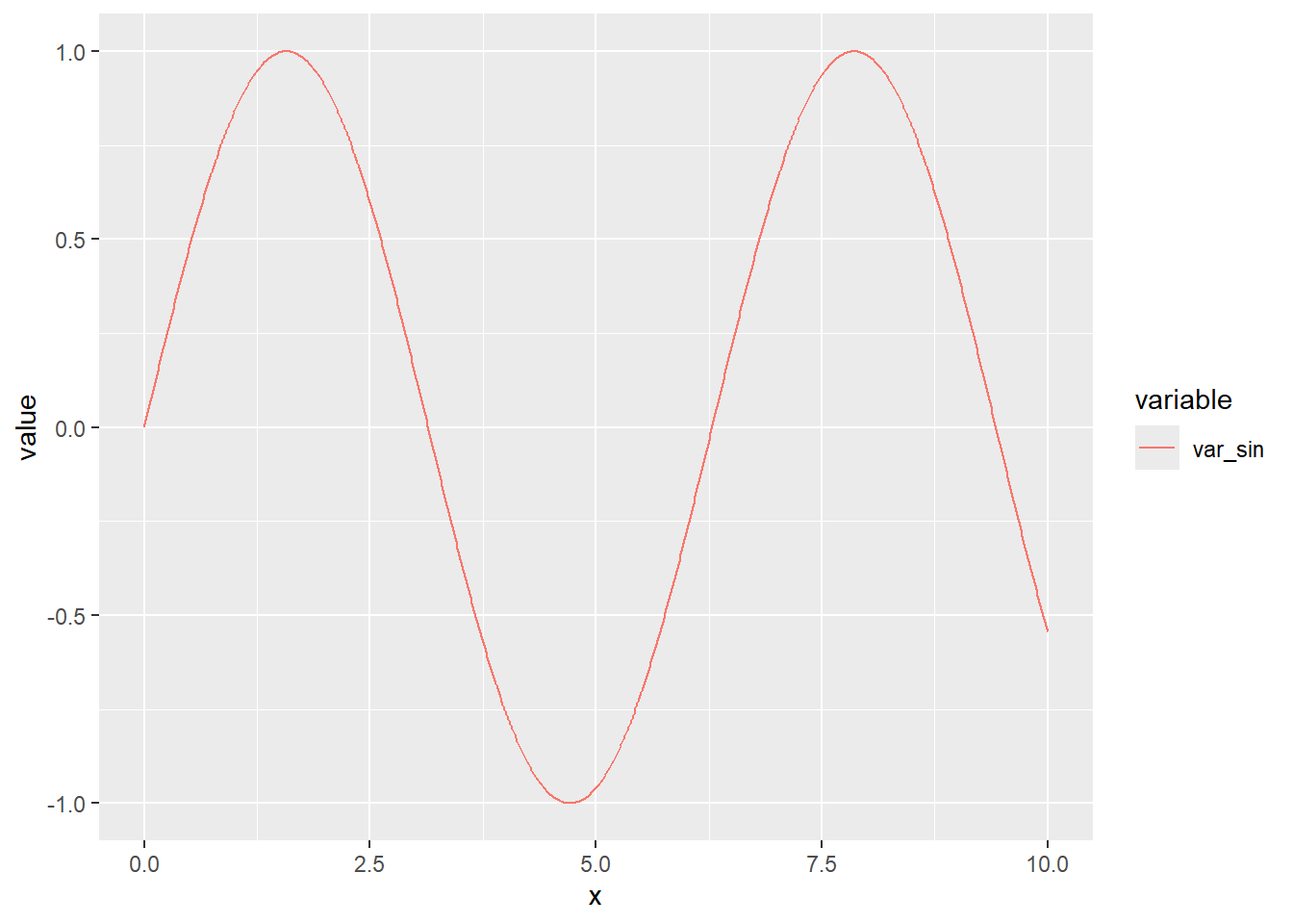
var_sin variable. This variable represents
a sine wave and is well-suited for a time series representation. Here's
the R code to create a time series plot:library(ggplot2)Warning: il pacchetto 'ggplot2' è stato creato con R versione 4.3.3p <- ggplot(dtm[variable == "var_sin"], aes(x = x, y = value, group = variable)) +
geom_line(aes(linetype = variable, color = variable))
pggplot2 to create
a line plot for the var_sin variable.Distribution
Plots
var_random,
var_norm, and
var_sin. Histograms provide a visual
representation of the frequency distribution of data values. Here's the
R code:p3 <- ggplot(dtm[variable == "var_sin"], aes(y = value, group = variable)) +
geom_histogram(bins = 20)
p4 <- ggplot(dtm[variable == "var_norm"], aes(y = value, group = variable)) +
geom_histogram(bins = 20)
p5 <- ggplot(dtm[variable == "var_random"], aes(y = value, group = variable)) +
geom_histogram(bins = 20)
p3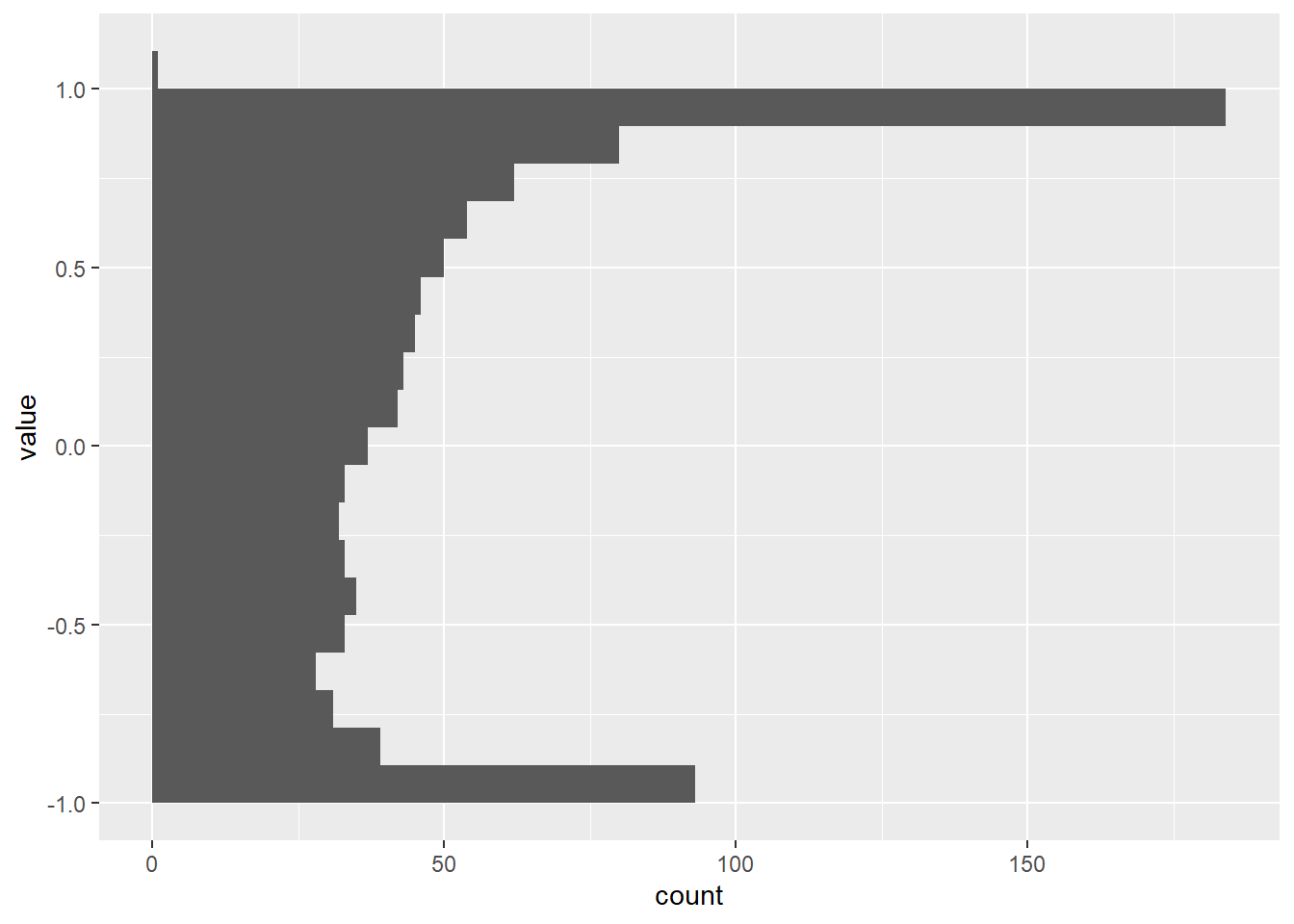
p4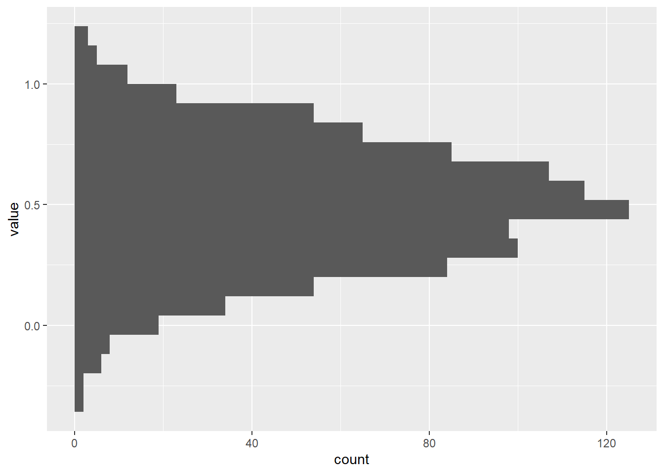
p5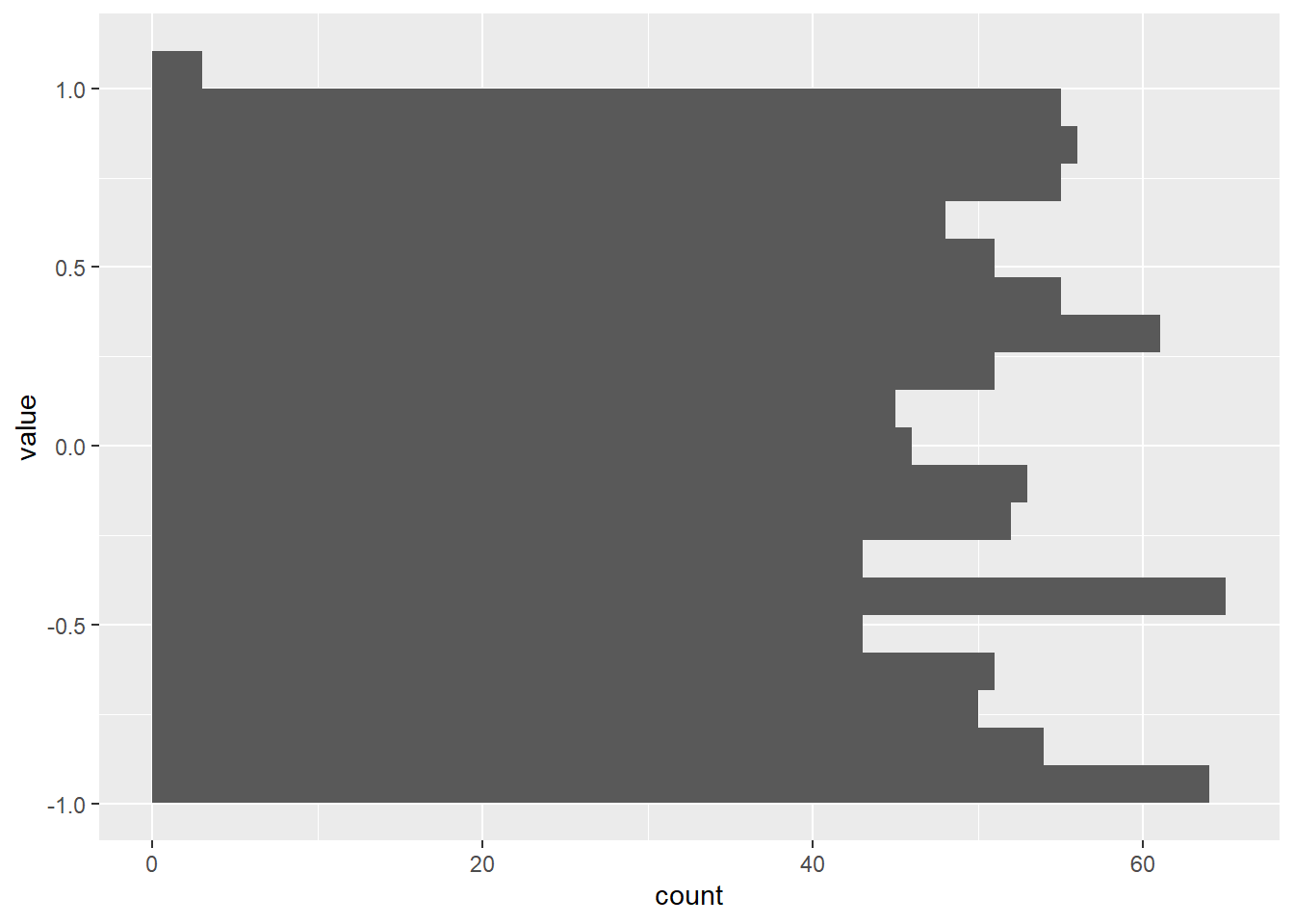
Correlation
Plots
var_sin and
var_sin2:options(repr.plot.width = 7, repr.plot.height = 7)
var_random2 <- runif(x,y_min,y_max)
var_norm2 <- rnorm(x,y_mean,y_sd)
var_sin2 <- sin(x) + rnorm(x,0,0.01)
df2<- data.frame(df,var_sin2,var_norm2,var_random2)
dt2 <- data.table(df2)
p10 <- ggplot(dt2) + geom_point(aes(x = var_sin, y = var_sin2))
p10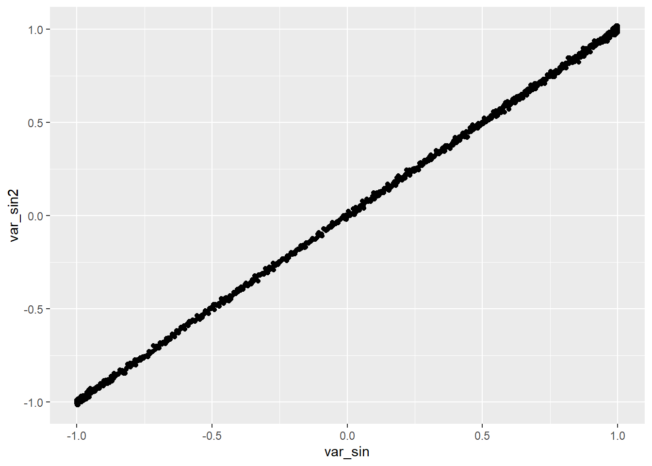
Box
Plots
var_random,
var_norm, and
var_sin:p6 <- ggplot(dtm, aes(x = variable, y = value)) +
geom_boxplot()
p6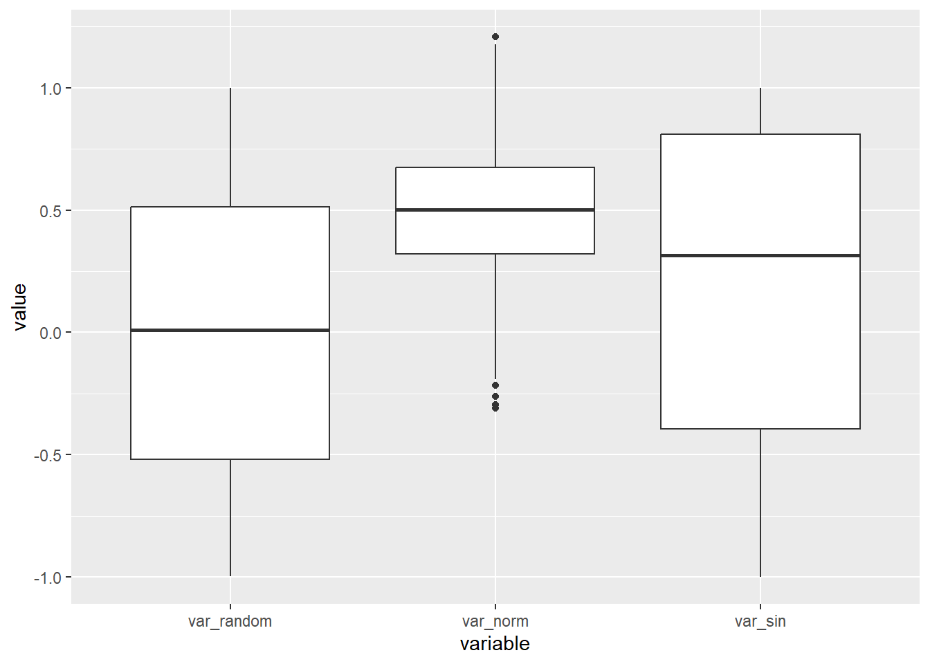
Pair
Plots
library(GGally)Registered S3 method overwritten by 'GGally':
method from
+.gg ggplot2pair_plot <- ggpairs(dt2, columns = c("var_random", "var_norm", "var_sin", "var_sin2"))
pair_plotWarning in geom_point(): All aesthetics have length 1, but the data has 16 rows.
ℹ Please consider using `annotate()` or provide this layer with data containing
a single row.
Time Series
Decomposition
var_sin data.# Install and load the forecast library if not already installed
if (!requireNamespace("forecast", quietly = TRUE)) {
install.packages("forecast")
}Registered S3 method overwritten by 'quantmod':
method from
as.zoo.data.frame zoo library(forecast)
# Decompose the time series
sin_decomp <- decompose(ts(dt2$var_sin, frequency = 365))
# Plot the decomposed components
plot(sin_decomp)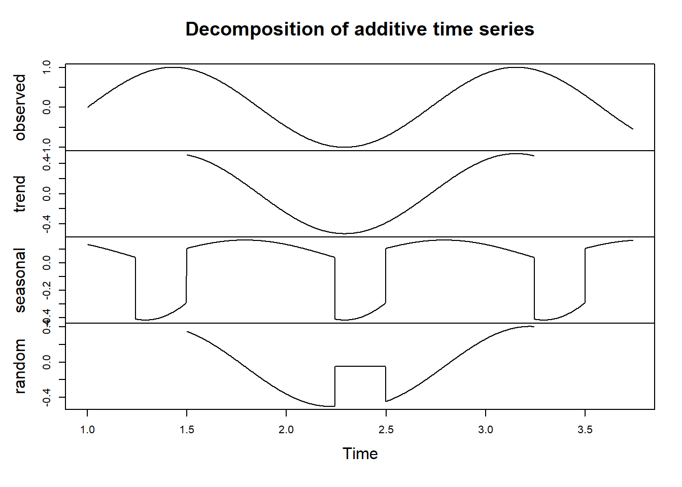
var_sin time series
using the decompose function. We specify a
frequency of 365 since the data represents daily observations.Interactive
Visualizations
plotly or
shiny, allow users to explore data
interactively. You can create interactive scatter plots, line plots, or
heatmaps, enhancing the user's ability to dig deeper into the data.# Install and load the Plotly library if not already installed
if (!requireNamespace("plotly", quietly = TRUE)) {
install.packages("plotly")
}
library(plotly)Caricamento pacchetto: 'plotly'Il seguente oggetto è mascherato da 'package:ggplot2':
last_plotIl seguente oggetto è mascherato da 'package:stats':
filterIl seguente oggetto è mascherato da 'package:graphics':
layout# Create an interactive scatter plot
scatter_plot <- plot_ly(data = dt2, x = ~var_random, y = ~var_norm, text = ~paste("x:", x, "<br>var_random:", var_random, "<br>var_norm:", var_norm),
marker = list(size = 10, opacity = 0.7, color = var_sin)) %>%
add_markers() %>%
layout(title = "Interactive Scatter Plot",
xaxis = list(title = "var_random"),
yaxis = list(title = "var_norm"),
hovermode = "closest")
# Display the interactive scatter plot
scatter_plotExamples
Time
Series Decomposition for Insights
Introduction
var_sin time series to illustrate its
significance.Scenario:
Analyzing Daily Temperature Data
data.table library
to manage the dataset efficiently:# Install and load the necessary libraries if not already installed
if (!requireNamespace("data.table", quietly = TRUE)) {
install.packages("data.table")
}
library(data.table)
# Set the seed for reproducibility
set.seed(42)
# Generate a dataset with temperature data for multiple cities
cities <- c("New York", "Los Angeles", "Chicago", "Miami", "Denver")
start_date <- as.Date("2010-01-01")
end_date <- as.Date("2019-12-31")
date_seq <- seq(start_date, end_date, by = "day")
# Create a data.table for the dataset
temperature_data <- data.table(
Date = rep(date_seq, length(cities)),
City = rep(cities, each = length(date_seq)),
Temperature = rnorm(length(date_seq) * length(cities), mean = 60, sd = 20)
)
# Filter data for New York
ny_temperature <- temperature_data[City == "New York"]
# Decompose the daily temperature time series for New York
ny_decomp <- decompose(ts(ny_temperature$Temperature, frequency = 365))
# Plot the decomposed components for New York
plot(ny_decomp)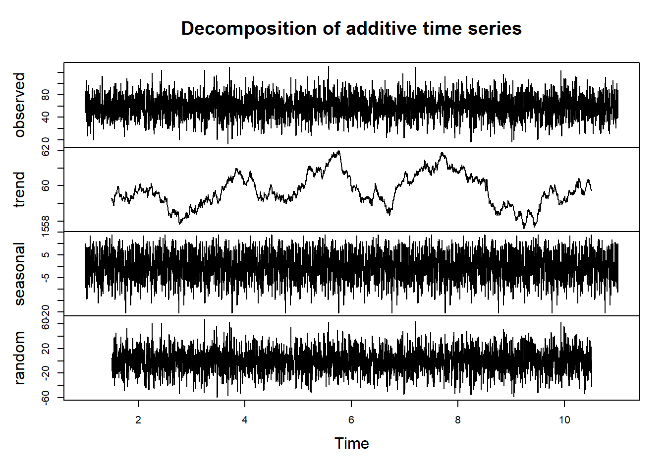
Performing
Time Series Decomposition
Interpretation
Insights and
Applications
Leveraging
Distribution Plots for In-Depth Analysis
Introduction
var_random variable.Scenario:
Analyzing Exam Scores
Analyzing
the Distribution of Exam Scores
var_random variable. This will
help us answer the questions posed above.# Install and load the necessary libraries if not already installed
if (!requireNamespace("ggplot2", quietly = TRUE)) {
install.packages("ggplot2")
}
library(ggplot2)
# Create a histogram to visualize the distribution of exam scores
p3 <- ggplot(dtm[variable == "var_random"], aes(y = value, group = variable)) +
geom_histogram(bins = 20, fill = "lightblue", color = "black", alpha = 0.7) +
theme_minimal() +
labs(title = "Distribution of Exam Scores",
x = "Scores",
y = "Frequency")
# Display the histogram
p3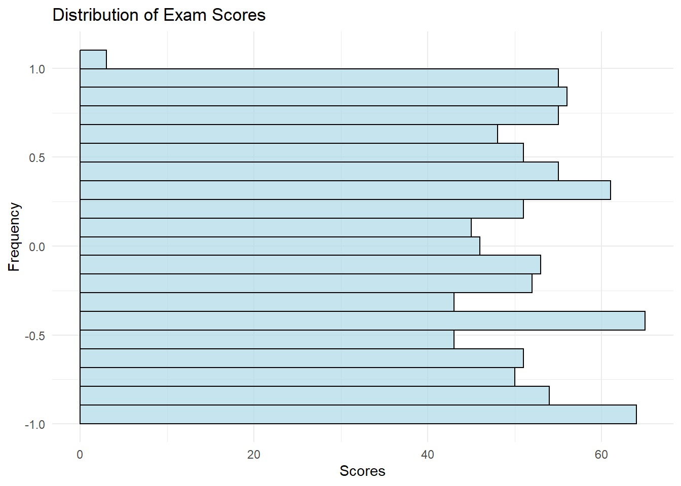
Interpretation
Insights and
Applications
Correlation
Analysis
Creating Complex
Datasets
# Create an academic performance dataset
set.seed(123)

num_students <- 500

academic_data <- data.frame(
  Student_ID = 1:num_students,
  Exam_Score = rnorm(num_students, mean = 75, sd = 10),
  Assignment_Score = rnorm(num_students, mean = 85, sd = 5),
  Final_Project_Score = rnorm(num_students, mean = 90, sd = 7)
)# Create a study habits and activities dataset
set.seed(456)
study_data <- data.frame(
Student_ID = 1:num_students,
Study_Hours = rpois(num_students, lambda = 3) + 1,
Extracurricular_Hours = rpois(num_students, lambda = 2),
Stress_Level = rnorm(num_students, mean = 5, sd = 2)
)Advanced
Correlation Analysis
# Calculate correlations between variables
correlation_matrix <- cor(academic_data[, c("Exam_Score", "Assignment_Score", "Final_Project_Score")],
                          study_data[, c("Study_Hours", "Extracurricular_Hours", "Stress_Level")])

# Install and load the necessary libraries if not already installed
if (!requireNamespace("corrplot", quietly = TRUE)) {
  install.packages("corrplot")
}

library(corrplot)
corrplot 0.92 loaded# Create a heatmap to visualize correlations
corrplot(correlation_matrix, method = "color", type = "lower", tl.col = "black")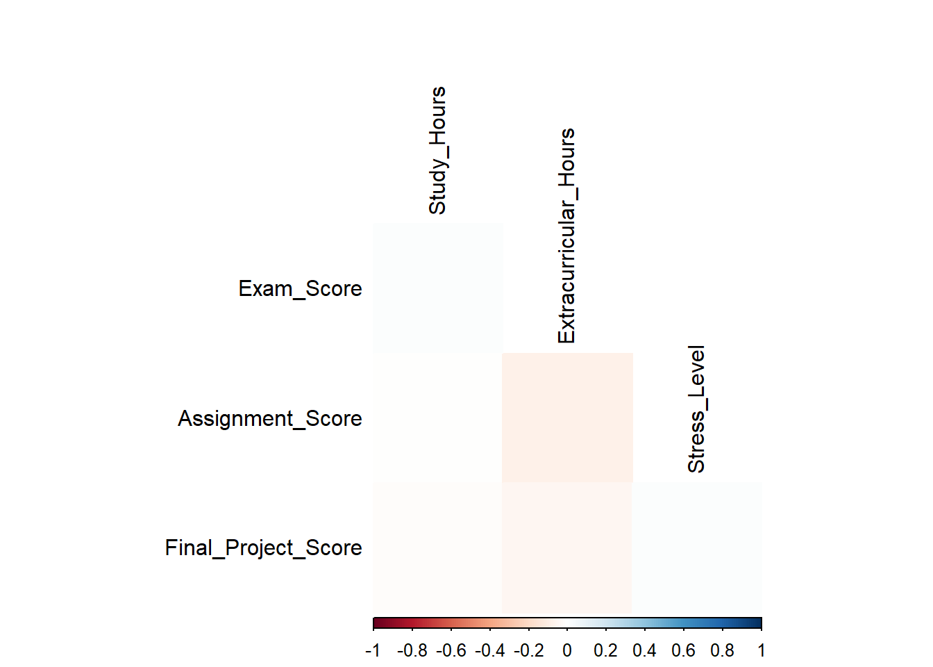
Interpretation
Insights and
Applications
Exploring
Diverse Distributions with Box Plots
Creating Complex
Datasets
# Create a sales dataset
set.seed(789)

num_months <- 24
product_categories <- c("Electronics", "Clothing", "Home Decor", "Books")

sales_data <- data.frame(
  Month = rep(seq(1, num_months), each = length(product_categories)),
  Product_Category = rep(product_categories, times = num_months),
  Sales = rpois(length(product_categories) * num_months, lambda = 1000)
)

# Create a customer demographics dataset
set.seed(101)

num_customers <- 300

demographics_data <- data.frame(
  Customer_ID = 1:num_customers,
  Age = rnorm(num_customers, mean = 30, sd = 5),
  Income = rnorm(num_customers, mean = 50000, sd = 15000),
  Education_Level = sample(c("High School", "Bachelor's", "Master's", "Ph.D."),
                           size = num_customers, replace = TRUE)
)

# Create a box plot to visualize sales distributions by product category
p5 <- ggplot(sales_data, aes(x = Product_Category, y = Sales, fill = Product_Category)) +
     geom_boxplot() +
     theme_minimal() +
     labs(title = "Sales Distribution by Product Category",
          x = "Product Category",
          y = "Sales")

# Display the box plot
p5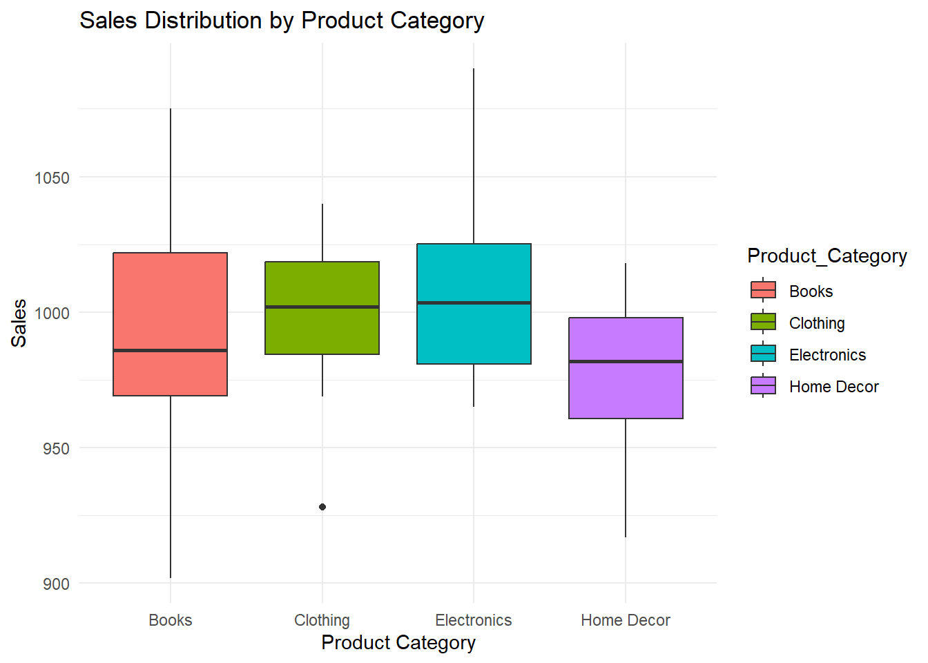
# Create a box plot to visualize the distribution of customer ages
p6 <- ggplot(demographics_data, aes(y = Age, x = "Age")) +
     geom_boxplot(fill = "lightblue", color = "black", alpha = 0.7) +
     theme_minimal() +
     labs(title = "Customer Age Distribution (Box Plot)",
          x = "",
          y = "Age")

# Display the box plot
p6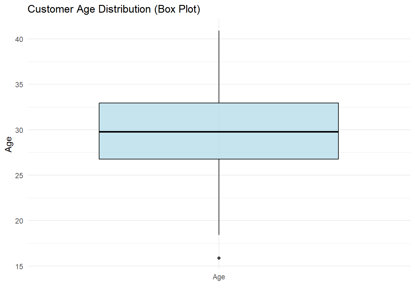
Interpretation
Insights and
Applications
Interactive
Data Visualization with Plotly
Creating
an Interactive Time Series Plot
if (!requireNamespace("plotly", quietly = TRUE)) {
  install.packages("plotly")
}

library(plotly)

# Create a sample time series dataset
set.seed(789)

num_months <- 24

time_series_data <- data.frame(
  Date = seq(as.Date("2022-01-01"), by = "months", length.out = num_months),
  Company_A = cumsum(rnorm(num_months, mean = 0.02, sd = 0.05)),
  Company_B = cumsum(rnorm(num_months, mean = 0.03, sd = 0.04)),
  Company_C = cumsum(rnorm(num_months, mean = 0.01, sd = 0.03))
)

# Create an interactive time series plot with Plotly
interactive_plot <- plot_ly(data = time_series_data, x = ~Date) %>%
  add_trace(y = ~Company_A, name = "Company A", type = "scatter", mode = "lines") %>%
  add_trace(y = ~Company_B, name = "Company B", type = "scatter", mode = "lines") %>%
  add_trace(y = ~Company_C, name = "Company C", type = "scatter", mode = "lines") %>%
  layout(
    title = "Monthly Stock Prices",
    xaxis = list(title = "Date"),
    yaxis = list(title = "Price"),
    showlegend = TRUE
  )

# Display the interactive plot
interactive_plot
Interaction
Features
Insights and
Applications
Interaction
Features
Insights and
Applications
References
Additional details
Description
Introduction to Exploratory Data Analysis (EDA) Exploratory Data Analysis (EDA) is the crucial first step in the data analysis process. Before applying complex statistical models or machine learning algorithms, it is essential to understand the structure, trends, and peculiarities of the data you are working with.
Identifiers
- UUID
- a01dbdb5-a57f-4243-a184-efd9a75939c7
- GUID
- https://giorgioluciano.github.io/posts/010_Data_Visualization/
- URL
- https://giorgioluciano.github.io/posts/010_Data_Visualization
Dates
- Issued
-
2023-09-15T22:00:00
- Updated
-
2023-09-15T22:00:00
References
- Schloerke, Barret, Di Cook, Joseph Larmarange, Francois Briatte, Moritz Marbach, Edwin Thoen, Amos Elberg, and Jason Crowley. 2021. "GGally: Extension to 'Ggplot2'." https://CRAN.R-project.org/package=GGally. https://cran.r-project.org/package=GGally
- Wickham, Hadley. 2016. "Ggplot2: Elegant Graphics for Data Analysis." . https://ggplot2.tidyverse.org