Soooo, my last job at Deck was amazing. I loved it. I was doing data engineer stuff there, mostly maintaining infrastructure for data pipelines. Everyone was great and the mission was amazing: helping Democrats win. Yet the company was shut down about a month ago, sending me on another job search, the 3rd since early/mid 2021.
Messaggi di Rogue Scholar
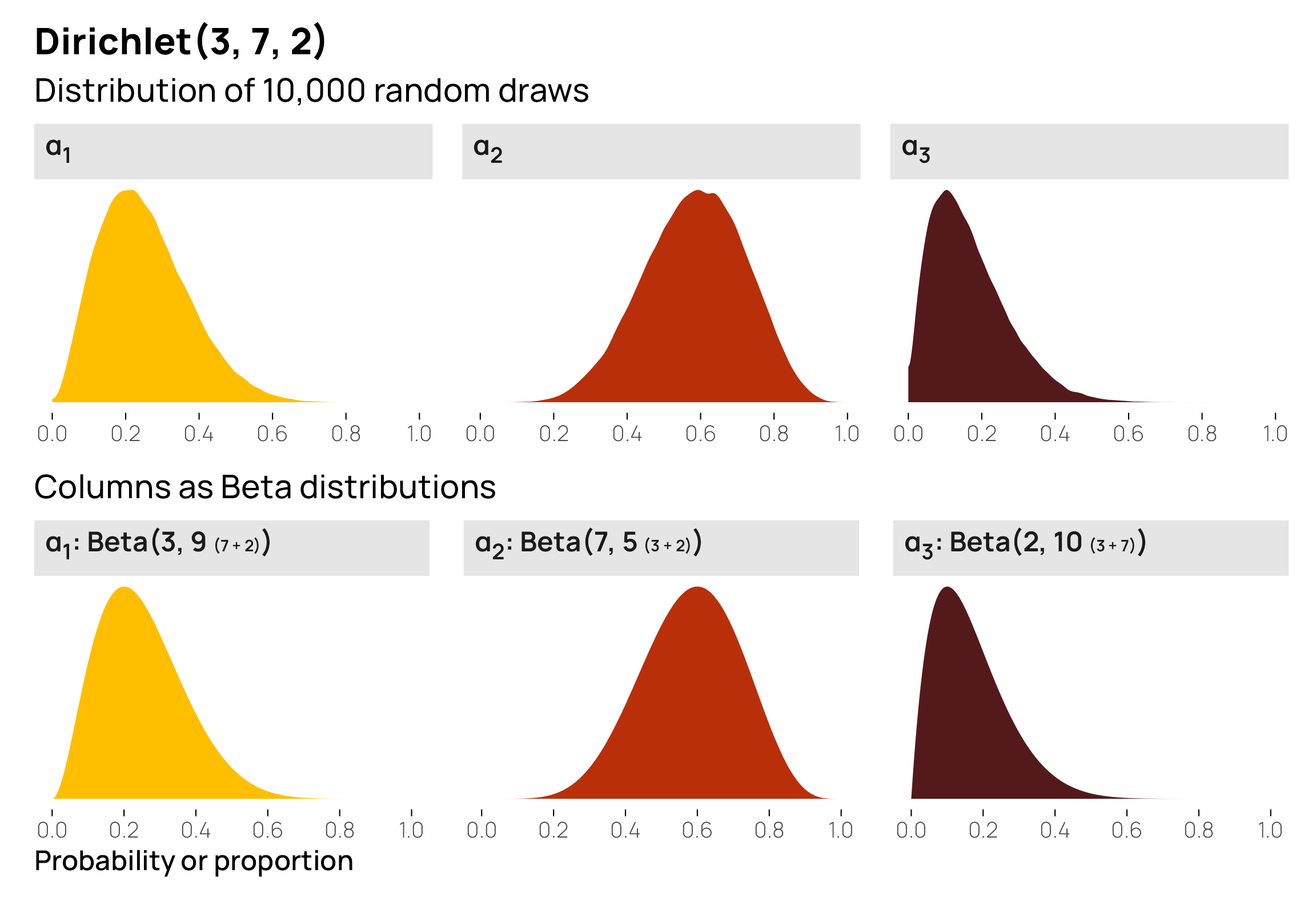
I’ve been finishing up a project that uses ordered Beta regression (Kubinec 2022), a neat combination of Beta regression and ordered logistic regression that you can use for modeling continuous outcomes that are bounded on either side (in my project, we’re modeling a variable that can only be between 1 and 32, for instance). It’s possible to use something like zero-one-inflated Beta regression for outcomes like this, but that kind of model
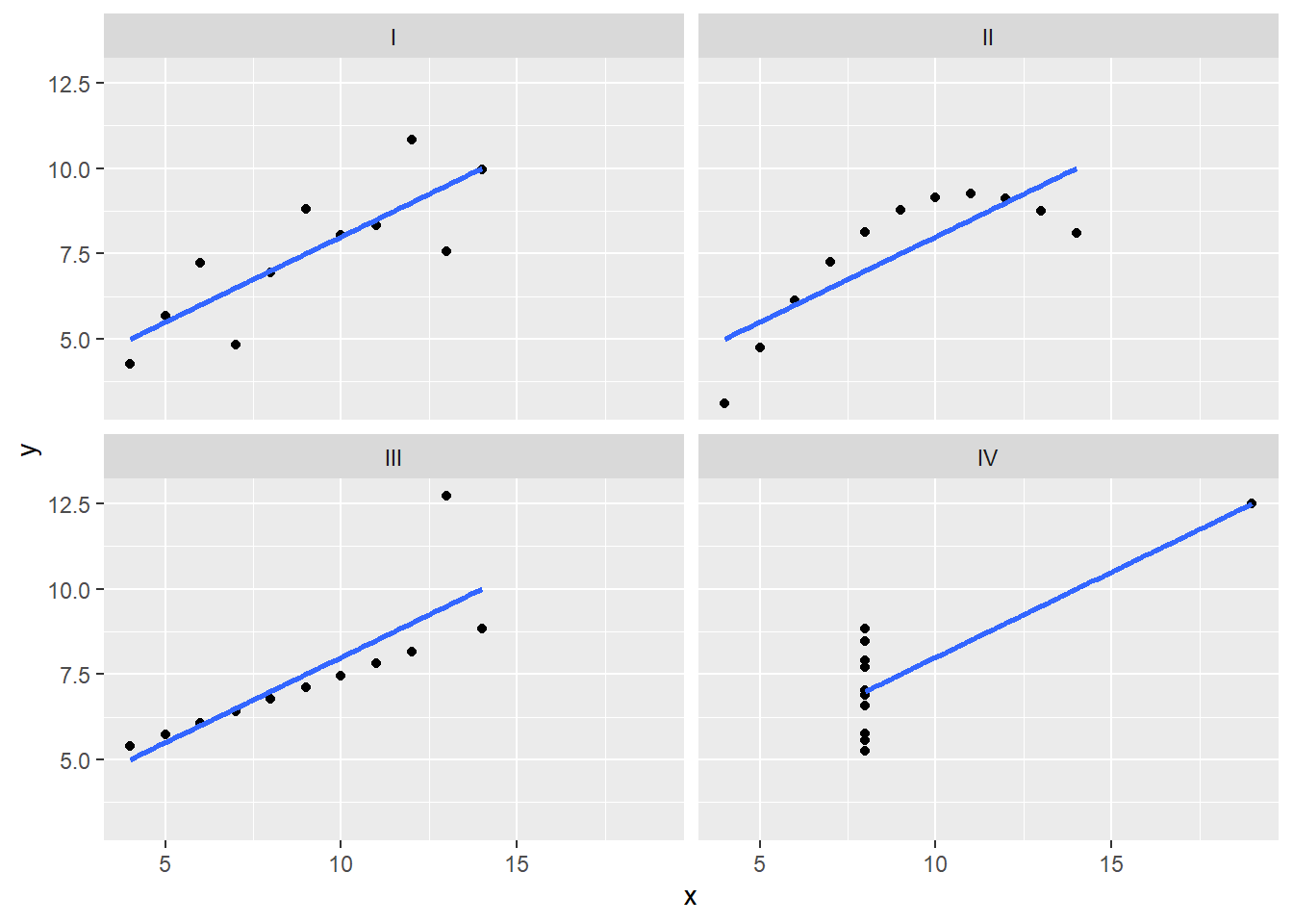
Anscombe’s Quartet, known as the “Anscombe’s Test,” consists of four datasets with very similar descriptive statistics but visually distinct characteristics. These quartets serve as an enlightening example of the importance of visualizing data before drawing conclusions. In this post, we will delve into how to calculate and visualize Anscombe’s Quartet using R and the powerful ggplot2 library.
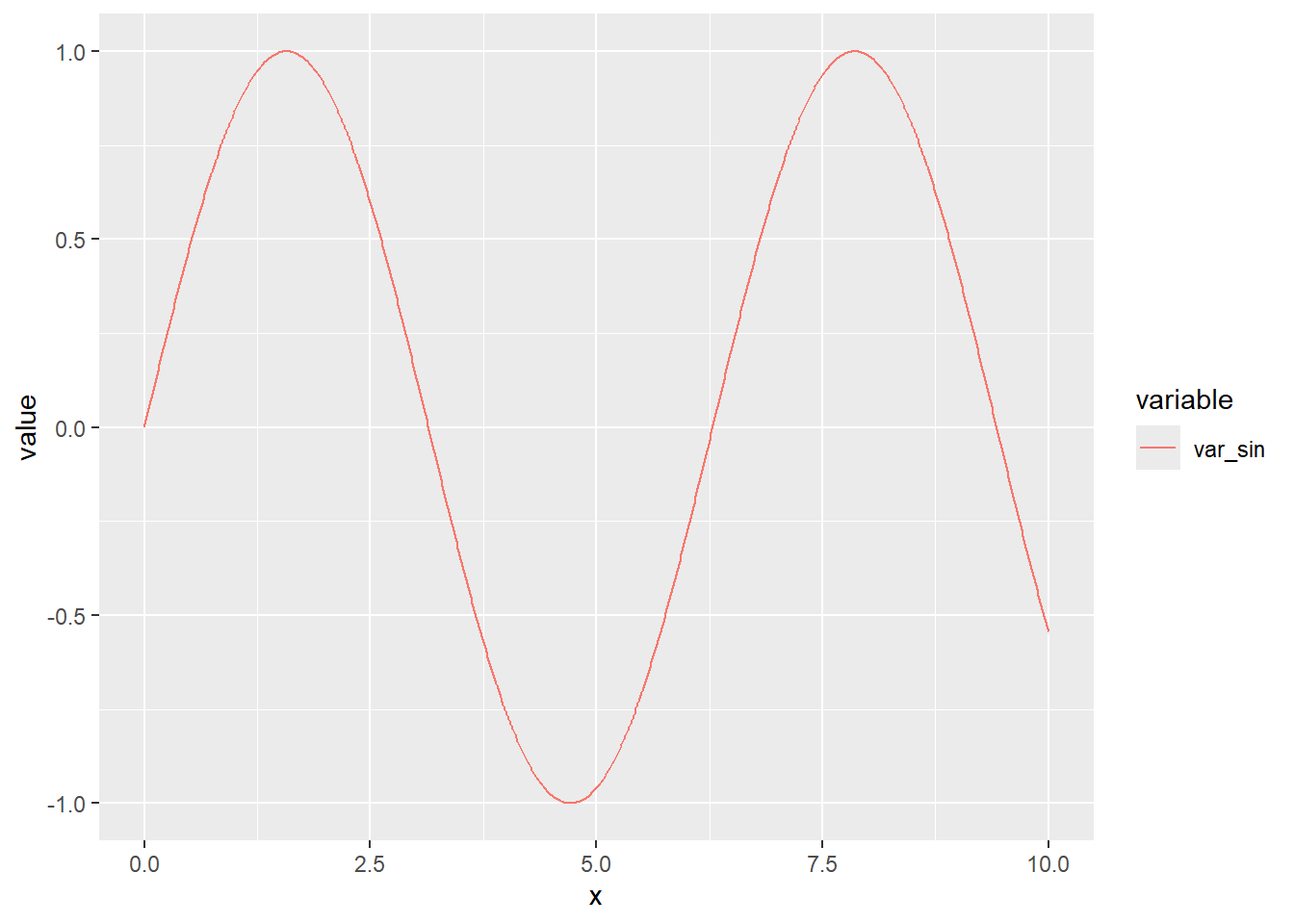
Introduction to Exploratory Data Analysis (EDA) Exploratory Data Analysis (EDA) is the crucial first step in the data analysis process. Before applying complex statistical models or machine learning algorithms, it is essential to understand the structure, trends, and peculiarities of the data you are working with.
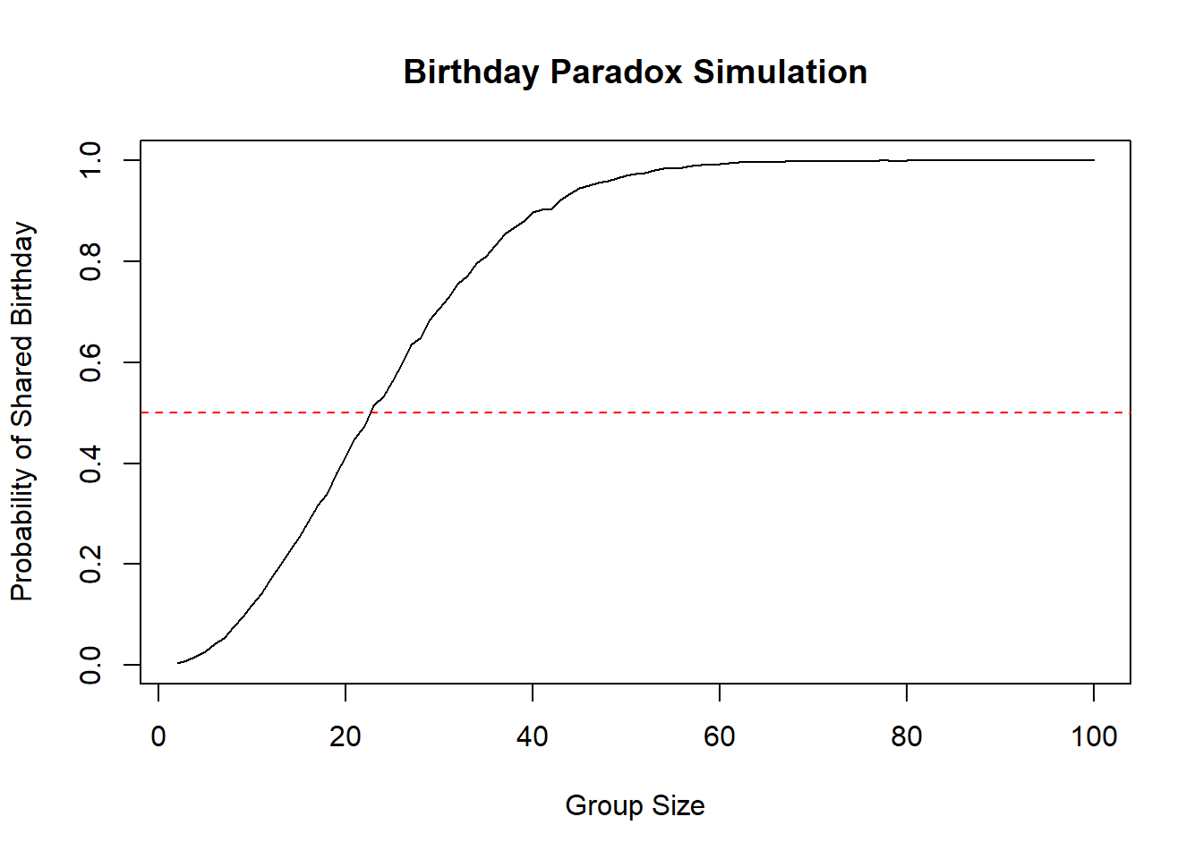
The Birthday Paradox is a probabilistic problem concerning the likelihood that two people in a group share the same birthday. At first glance, it might seem like the probability is very low, but in reality, it’s higher than you might think. The paradox is based on the fact that there are many possible combinations of people’s birthdays within a group.
library(viridis) # Import the viridis color palette library library(ggplot2) set.seed(123) # Set a seed for reproducibility num_flips <- 50000 flips <- sample(c("Heads", "Tails"), num_flips, replace = TRUE) # Image aspect ratio aspect_ratio <- 1 # You can customize the aspect ratio here n_col <- round(sqrt(num_flips) * aspect_ratio) n_row <- ceiling(num_flips / n_col) # Create a color matrix to represent coin flips colors <-

In a project I’m working on, I need to generate predictions from a logistic regression model.
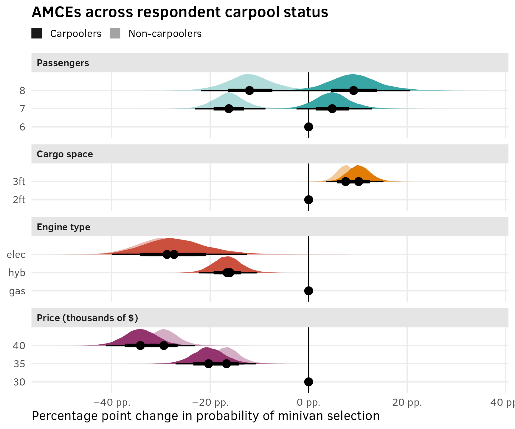
I recently posted a guide (mostly for future-me) about how to analyze conjoint survey data with R. I explore two different estimands that social scientists are interested in—causal average marginal component effects (AMCEs) and descriptive marginal means—and show how to find them with R, with both frequentist and Bayesian approaches. However, that post is a little wrong. It’s not wrong wrong, but it is a bit oversimplified.
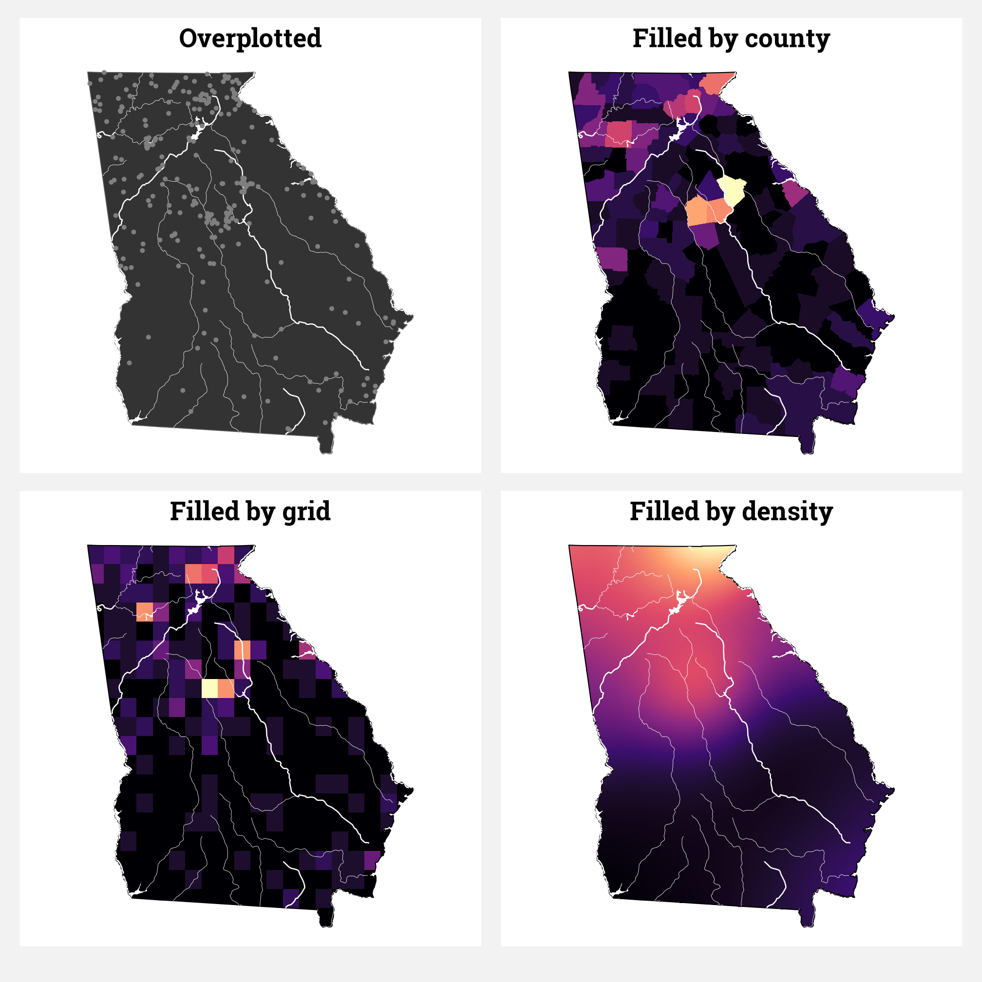
The students in my summer data visualization class are finishing up their final projects this week and I’ve been answering a bunch of questions on our class Slack. Often these are relatively standard reminders of how to tinker with specific ggplot layers (chaning the colors of a legend, adding line breaks in labels, etc.), but today one student had a fascinating and tricky question that led me down a realy fun dataviz rabbit hole.
In my research, I study international nongovernmental organizations (INGOs) and look at how lots of different institutional and organizational factors influence INGO behavior. For instance, many authoritarian regimes have passed anti-NGO laws and engaged in other forms of legal crackdown, which has forced NGOs to change their programming strategies and their sources of funding.