Visualization & Pearson’s correlation coefficient The 30DayChartChallenge is a data visualization community that hosts daily challenges for April. Today’s challenge involves dinosaurs. I used the Datasaurus package to create an animated visualization to demonstrate the importance of graphing data, and the effects of outliers on statistical properties.
Rogue Scholar Posts

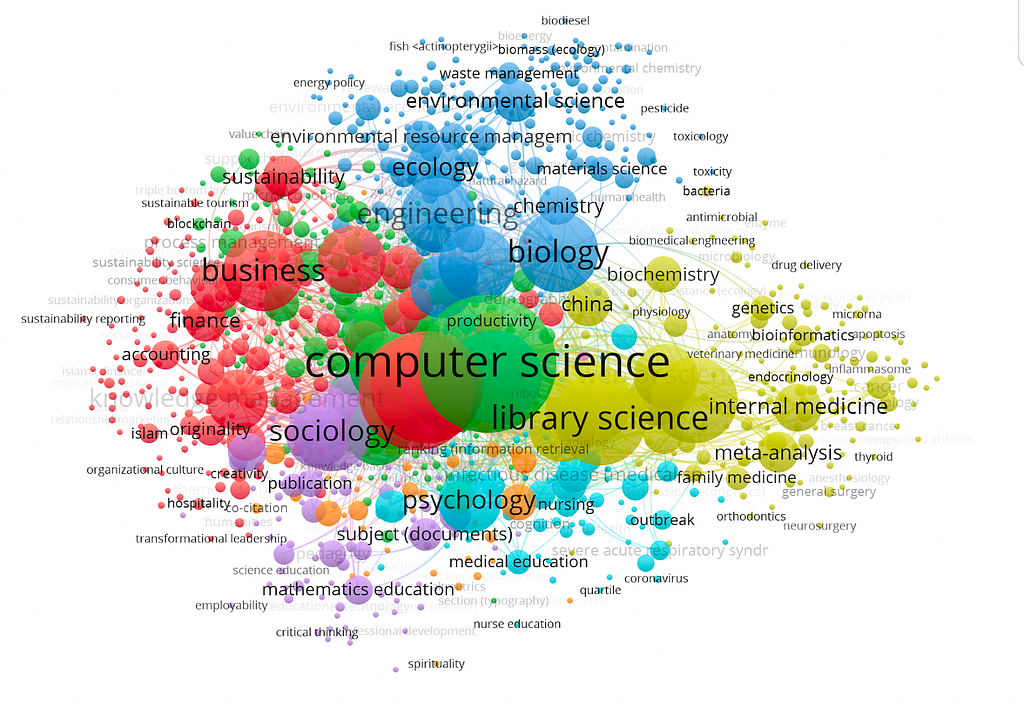
Exploring the OpenAlex Data Structure and Visualization Author: Qingqin Fang ( ORCID: 0009–0003–5348–4264) Introduction to OpenAlex In today’s world, the realm of research papers is brimming with countless hot topics, and the sheer volume of publications can be overwhelming.

A lot of our recent work revolves around working with conversational data, and one thing that’s struck me is that there are no easy ways to create compelling visualizations of conversation as it unfolds over time. The most common form seems to be pixelated screenshots of transcription software not made for this purpose.

Sketches, visualizations and other forms of externalizing cognition play a prominent role in the work of just about any scientist. It’s why we love using blackboards, whiteboards, notebooks and scraps of paper. Many folks who had the privilege of working the late Pieter Muysken fondly remember his habit of grabbing any old piece of paper that came to hand, scribbling while talking, then handing it over to you.

The 10th anniversary of the EMBO Workshop: Visualising Biological Data (VIZBI 2019) took place in EMBL in Heidelberg last week. GigaScience Data Scientist Chris Armit was there and was astonished at the cinematic quality of the visualisations that were showcased over this 3-day meeting.

Just because you have some geographical data doesn’t mean you should always map it but often the usage of data visualization with an interactive web map application can bring benefits to your project. Map visualization helps to reduce the degree of abstraction and supports communication and sense-making (a.k.a. data analysis) of your data.
The talks from the 2001 workshop on Visualizing Biological Data (VizBi 2011) are now available on Vimeo. There were some great talks at VizBi, especially the keynotes (the "featured videos" on the Vimeo page for VizBi).My own (slightly breathless) talk was on phylogeny visualisation, which you can watch below. Visualization of phylogenetics &