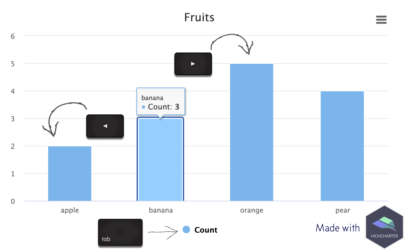
Over the past few weeks I’ve been experimenting with the accessibility module from Highcharts using the {highcharter} package by Joshua Kunst. Highcharts is an SVG-based library for making interactive charts for the web.

Over the past few weeks I’ve been experimenting with the accessibility module from Highcharts using the {highcharter} package by Joshua Kunst. Highcharts is an SVG-based library for making interactive charts for the web.
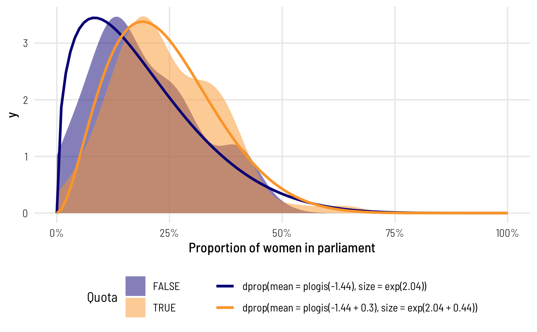
In the data I work with, it’s really common to come across data that’s measured as proportions: the percent of women in the public sector workforce, the amount of foreign aid a country receives as a percent of its GDP, the percent of religious organizations in a state’s nonprofit sector, and so on. When working with this kind of data as an outcome variable (or dependent variable) in a model, analysis gets tricky if you use standard models like

Here are some tricks for scraping the web with R and Python.

I’ve been teaching a course on program evaluation since Fall 2019, and while part of the class is focused on logic models and the more managerial aspects of evaluation, the bulk of the class is focused on causal inference. Ever since reading Judea Pearl’s The Book of Why in 2019, I’ve thrown myself into the world of DAGs, econometrics, and general causal inference, and I’ve been both teaching it and using it in research ever since.
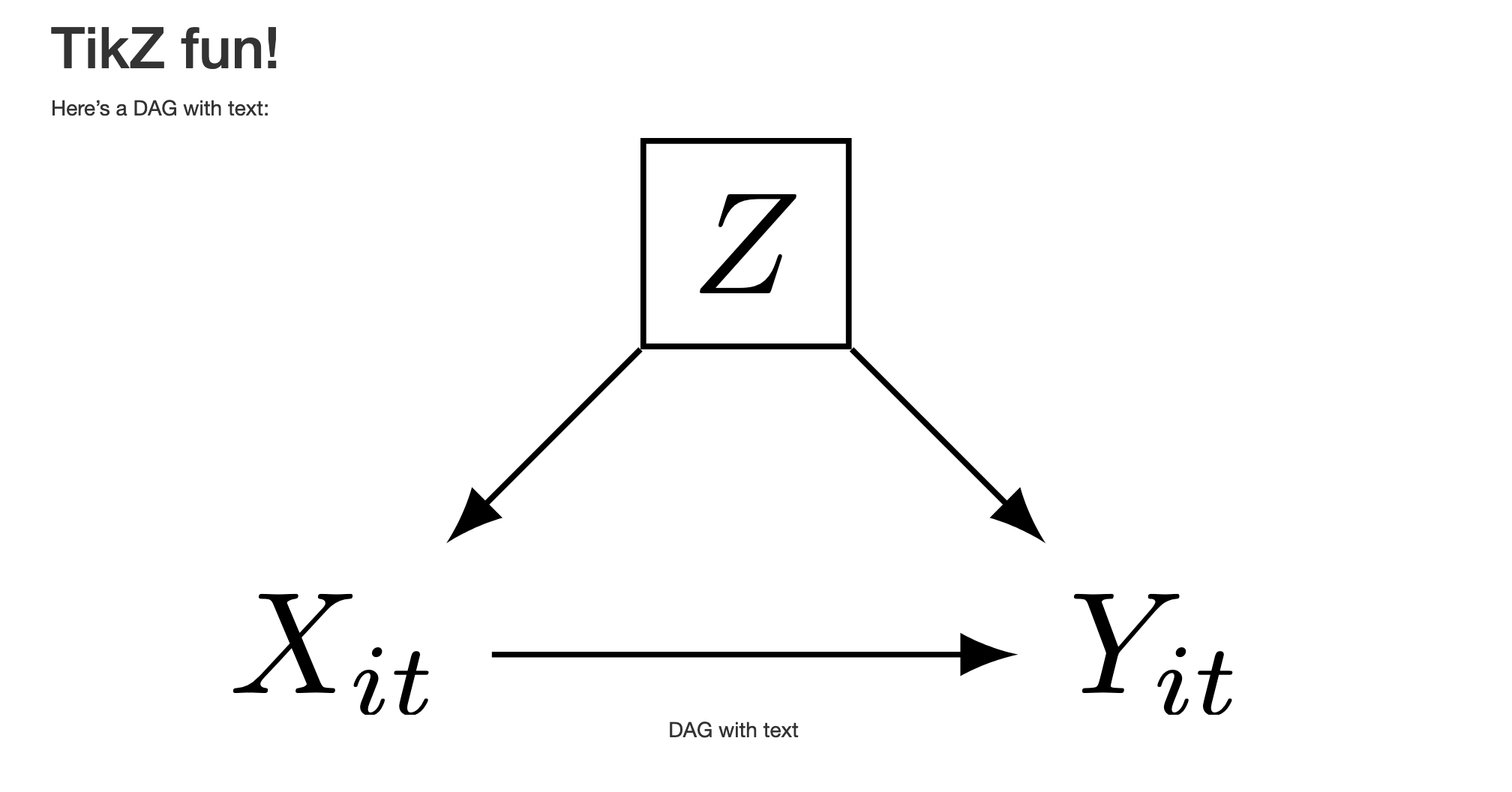
Update #1 An update to knitr has made it a ton easier to embed fonts in SVG files from R. Jump to the update to see how. Update #2 Also, it’s possible to change TikZ fonts and not use Computer Modern for everything! Jump to the second update to see how.
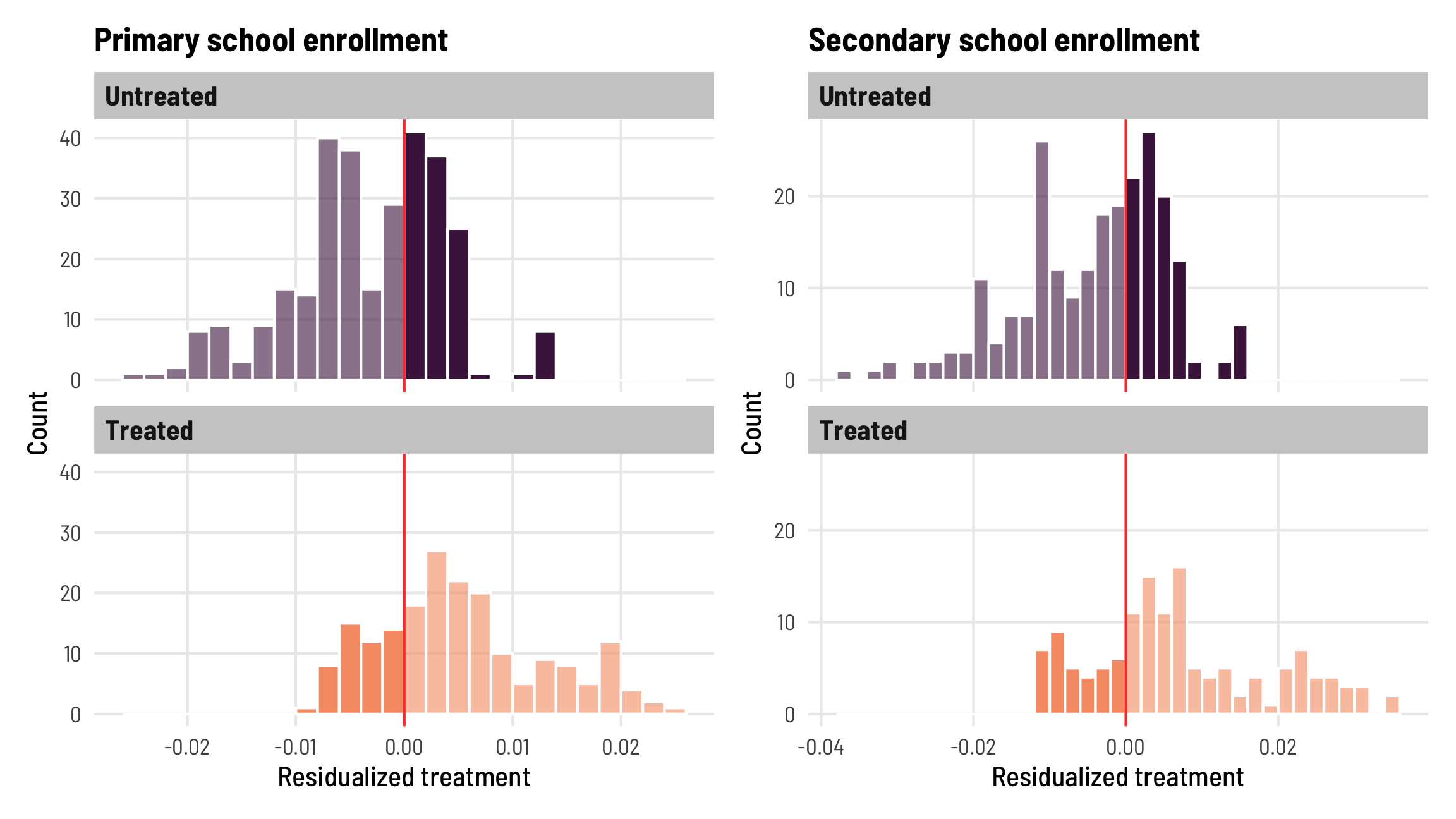
The world of econometrics has been roiled over the past couple years with a bunch of new papers showing how two-way fixed effects (TWFE; situations with nested levels of observations, like country-year, state-month, etc.) estimates of causal effects from difference-in-differences-based natural experiments can be biased when treatment is applied at different times.
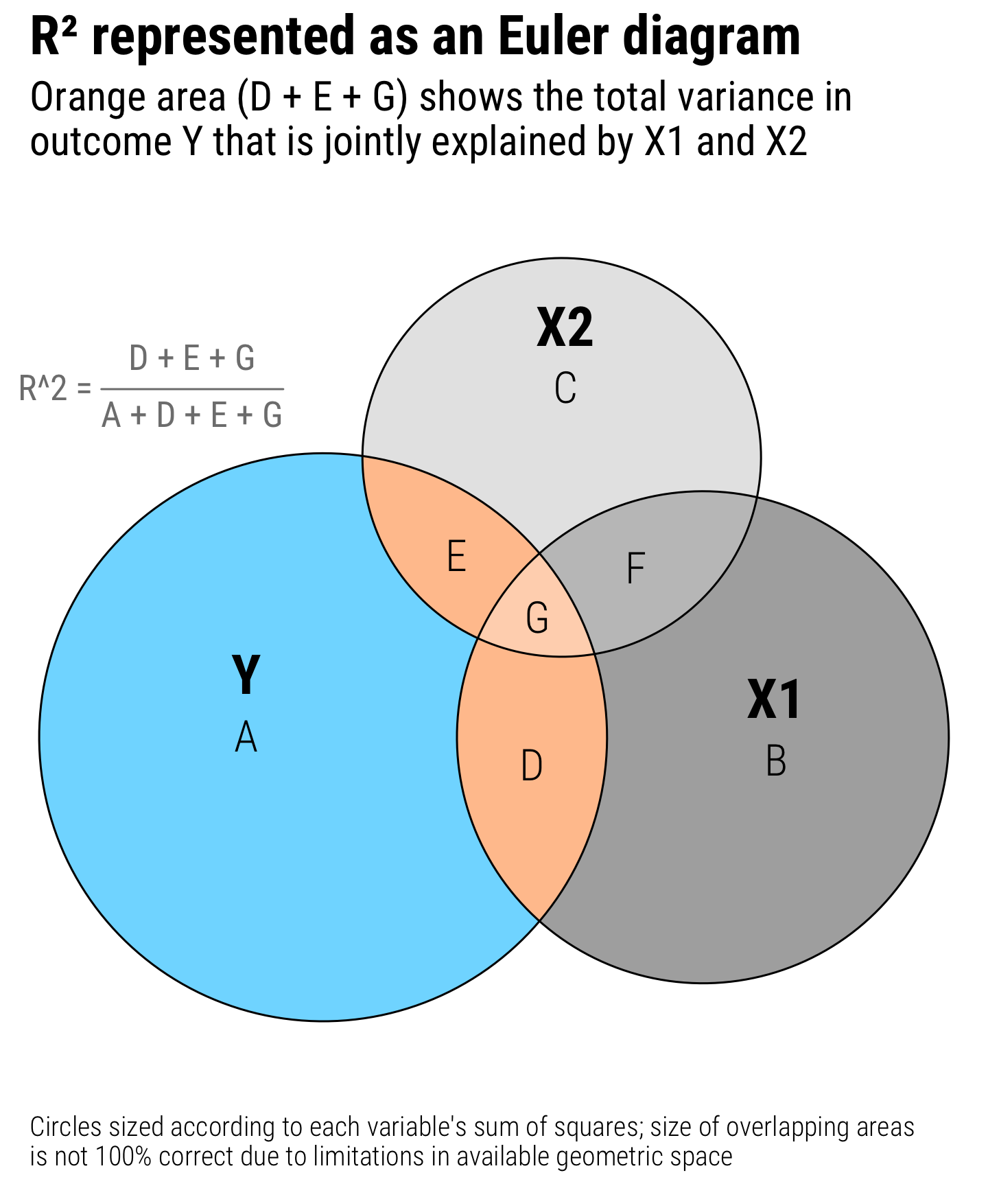
Regression is the core of my statistics and program evaluation/causal inference courses. As I’ve taught different stats classes, I’ve found that one of the regression diagnostic statistics that students really glom onto is . Unlike lots of regression diagnostics like AIC, BIC, and the joint F-statistic, has a really intuitive interpretation—it’s the percent of variation in the outcome variable explained by all the explanatory variables.

Here’s the software and packages that I use the most for my research.

Na publicação de hoje, quero trazer uma brincadeira que fiz comigo mesmo, um pequeno incentivo para voltar a publicar conteúdos sobre R (eu já estava enferrujado) entre outros assunto sobre economia. Passeando pelo instagram, encontrei um perfil que pública muita informação sobre economia em formato de visualização, o Economista Visual.
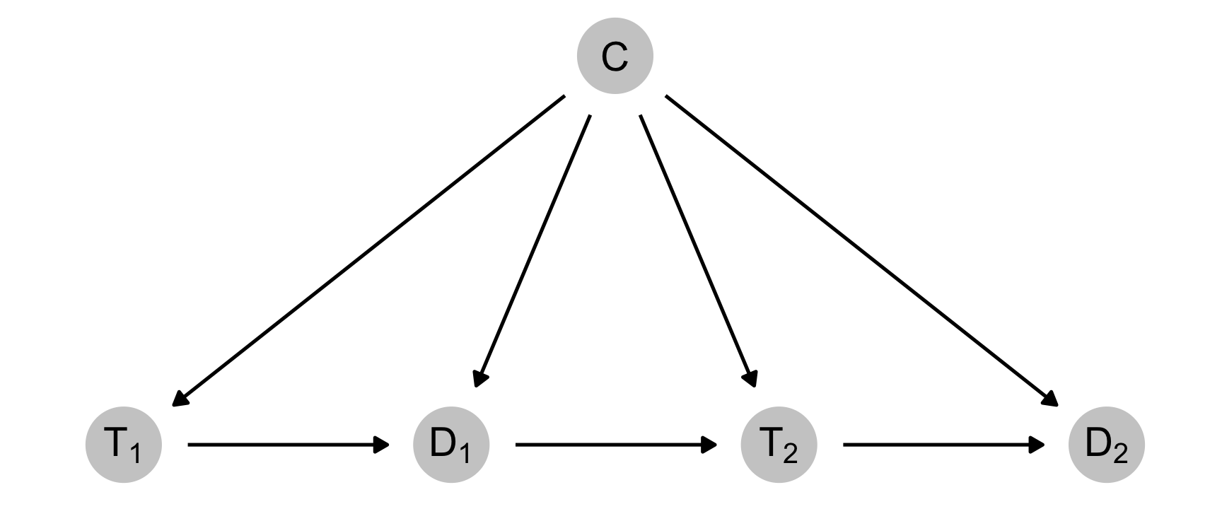
Since my last two blog posts on binary and continuous inverse probability weights (IPWs) and marginal structural models (MSMs) for time-series cross-sectional (TSCS) panel data, I’ve spent a ton of time trying to figure out why I couldn’t recover the exact causal effect I had built in to those examples when using panel data. It was a mystery, and it took weeks to figure out what was happening.