
Plot Data Along a Genome with karyoploteR
Creators & Contributors

karyoploteR is an R package that's been in Bioconductor for nearly a decade. It lets you create linear chromosomal representations of any genome with genomic annotations and experimental data plotted along them.
Bioconductor: https://bioconductor.org/packages/karyoploteR/
Paper: Bernat Gel & Eduard Serra. (2017). karyoploteR: an R/Bioconductor package to plot customizable genomes displaying arbitrary data. Bioinformatics, 31–33. doi:10.1093/bioinformatics/btx346.
I've used karyoploteR in several of my roles going as far back as when I used to run the Bioinformatics Core at UVA. Here are a few examples, mostly from the documentation and tutorials.
Examples
First, you'll need to install BiocManager to be able to install Bioconductor packages. The default genome in karyoploteR is hg19, so you will need to install the hg19 BSgenome package in addition to karyoploteR. You can use karyoploteR for any organism with a BSgenome package, and if there isn't one on Bioconductor already, you can forge your own.
install.packages("BiocManager")
BiocManager::install("karyoploteR")
BiocManager::install("BSgenome.Hsapiens.UCSC.hg19")
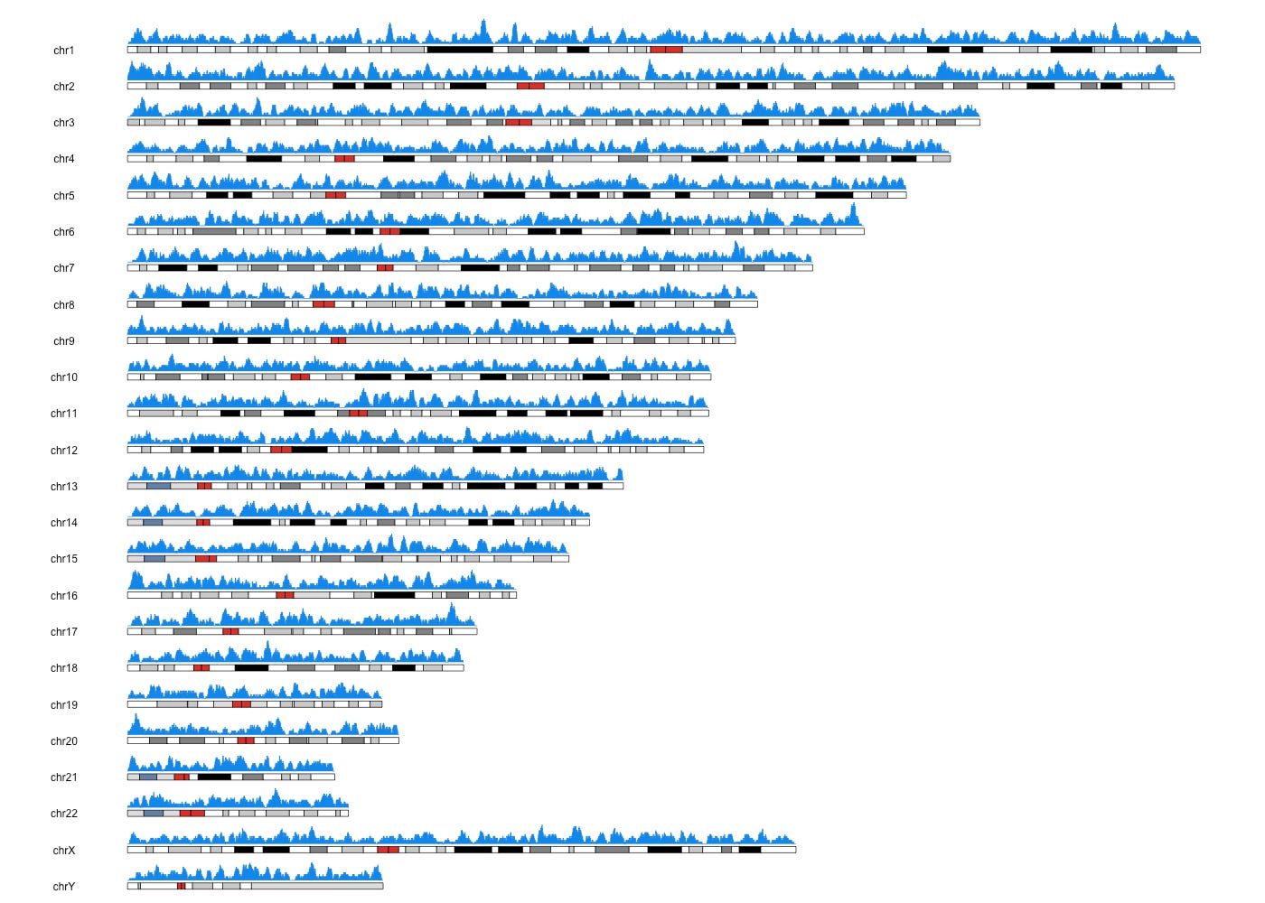
Plotting the density of genomic features
The kpPlotDensity() function will take a set of genomic features and will compute and plot its density using windows. To do that it will divide the genome in a equal sized windows and will count the number of feature overlapping each of the windows.
First let's create some random overlapping intervals.
library(karyoploteR)
set.seed(42)
regions <- createRandomRegions(nregions=10000,
                               length.mean = 1e6,
                               non.overlapping = FALSE)
Here's what that GRanges object looks like:
GRanges object with 10000 ranges and 0 metadata columns:
          seqnames              ranges strand
             <Rle>           <IRanges>  <Rle>
      [1]    chr22     8322895-9322921      *
      [2]     chr8   80014869-81014856      *
      [3]     chr7 139315352-140315358      *
      [4]     chr3     4962847-5962858      *
      [5]     chr7   14985662-15985669      *
      ...      ...                 ...    ...
   [9996]     chr6 145061257-146061244      *
   [9997]    chr18   62004615-63004584      *
   [9998]    chr17   49940278-50940271      *
   [9999]    chr16   80876622-81876625      *
  [10000]     chr6   59772438-60772452      *
  -------
Now we can create a new plot window and plot the density of these features with kpPlotDensity(). Remember, the default genome is hg19, but you can use any genome where you have a BSgenome package available.
kp <- plotKaryotype()
kpPlotDensity(kp, data=regions)
Here's the result:

Plotting the per base coverage of genomic features
The kpPlotCoverage function is similar to kpPlotDensity but instead of plotting the number of features overalpping a certain genomic window, it plots the actual number of features overlapping every single base of the genome. Let's use the same example random data we created above.
kp <- plotKaryotype()
kpPlotCoverage(kp, data=regions)
Here's the result:

You can plot individual chromosomes as well as the actual regions below the ideogram like this.
kp <- plotKaryotype(plot.type=2, chromosomes = "chr21")
kpPlotCoverage(kp, data=regions)
kpPlotRegions(kp, data=regions, data.panel=2)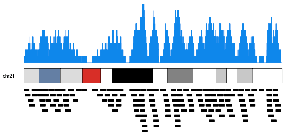
Plotting links between genomic regions
You can also plot lines between pairs of genomic regions, which is useful for illustrating translocations and other types of structural variations and genomic rearrangements. You can do this by specifying two GRanges objects, one for the start of the links and the other for the ends.
set.seed(123456)
starts <- sort(createRandomRegions(nregions = 25, length.sd = 8e6))
ends <- sort(createRandomRegions(nregions = 25, length.sd = 8e6))

kp <- plotKaryotype()
kpPlotRegions(kp, starts, r0=0, r1=0.5, col="#ff8d92")
kpPlotRegions(kp, ends, r0=0, r1=0.5, col="#8d9aff")
kpPlotLinks(kp, data=starts, data2=ends, col="#fac7ffaa", r0=0.5)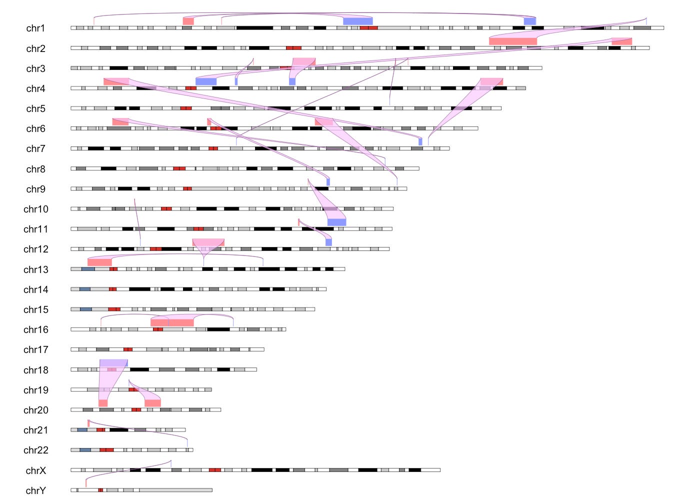
Manhattan plots
I wrote the qqman package back in 2014 (CRAN, GitHub, Paper). I haven't maintained this package in years, but it still works, and I see publications using this package for Manhattan plots all the time. But its feature set is pretty limited and does not work with Bioconductor data structures like GRanges (it uses data frames).
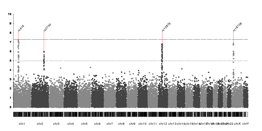
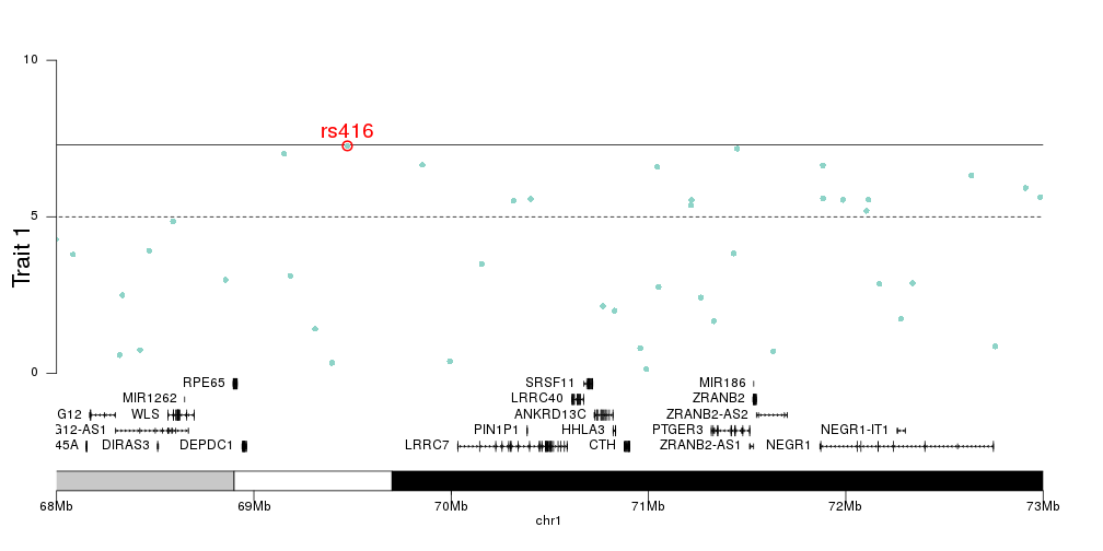
The karyoploteR package provides a kpPlotManhattan() function that takes in a GRanges with the SNP positions and the p-values of each SNP. I'll refer you to the tutorial on creating Manhattan plots with karyoploteR for the code used to create these. The karyoploteR package allows you to highlight regions of the genome or specific SNPs, change colors based on the chromosome, and label specific SNPs of interest, as well as combining plots.
Here are a few examples.


Other examples
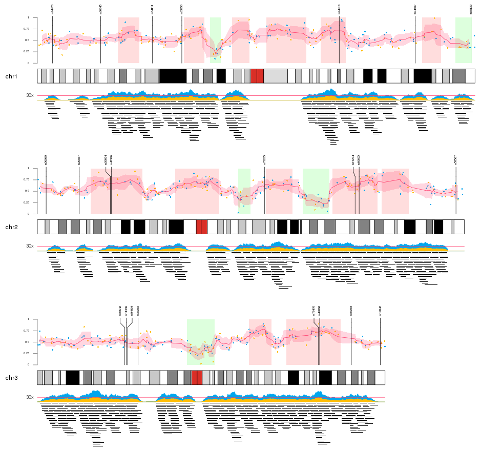
Look at the examples on the tutorial page for more inspiration. Here are a few of my favorites.
Plotting multiple data types:
Plotting expression results from DESeq2:

Plotting data from the ENCODE project:

Additional details
Description
Demos plotting genome density, per-base coverage, structural variation, GWAS Manhattan plots, combine multiple data types, gene expression results from DESeq2, epigenetic regulation from ENCODE
Identifiers
- GUID
- 164811544
- URL
- https://blog.stephenturner.us/p/plot-genome-data-karyoploter
Dates
- Issued
-
2025-07-07T12:44:15
- Updated
-
2025-07-07T12:44:15