Messaggi di Rogue Scholar

language
Pubblicato in The Ideophone
Autore Mark Dingemanse

Knots are fascinating: they tie together topology, embodied experience, and material culture. As Thai textile artist and designer Nithikul Nimkulrath (2024) has pointed out, knots are the kind of thing we come to know “ through and in making”. One of her artworks (see photo) explorers the materiality of knots by translating a physical, hand-knotted container into a 3D render.
Pubblicato in Data & Molecule Bits
Autore Giorgio Luciano

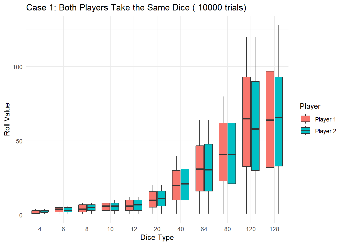
Embark on a journey into the realm of Dungeons & Dragons as we unravel a captivating fiddle riddle involving a dice duel. Using the power of the R programming language and the Monte Carlo simulation method, we’ll simulate the outcomes of duels between two players, each armed with a bag containing six distinct DnD dice. Prepare to explore the fascinating world of probability and randomness!

Pubblicato in Data & Molecule Bits
Autore Giorgio Luciano

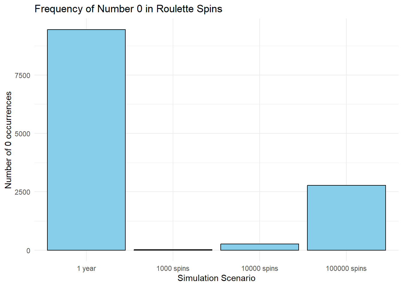
In this blog post, we’ll delve into the realm of casino roulette and use R simulations to estimate the frequency of the number 0 appearing over the span of a year (40 spins per hour x 24 hours x 365 days) . Roulette, a classic casino game, is known for its unpredictability, making it an interesting subject for probability exploration.

Pubblicato in quantixed

2023 has been a great year in running for me. Previous running round-ups are here (2022, 2021). My two main goals for 2023 were to run 3000 km and also to run 50 HM-or-more distance runs. I managed both with a couple of weeks left. I also bagged new PBs for 5K, 10K and half marathon as well as a handful of segments on Strava. I won no races but I did win two little running competitions at work.

Pubblicato in Data & Molecule Bits
Autore Giorgio Luciano

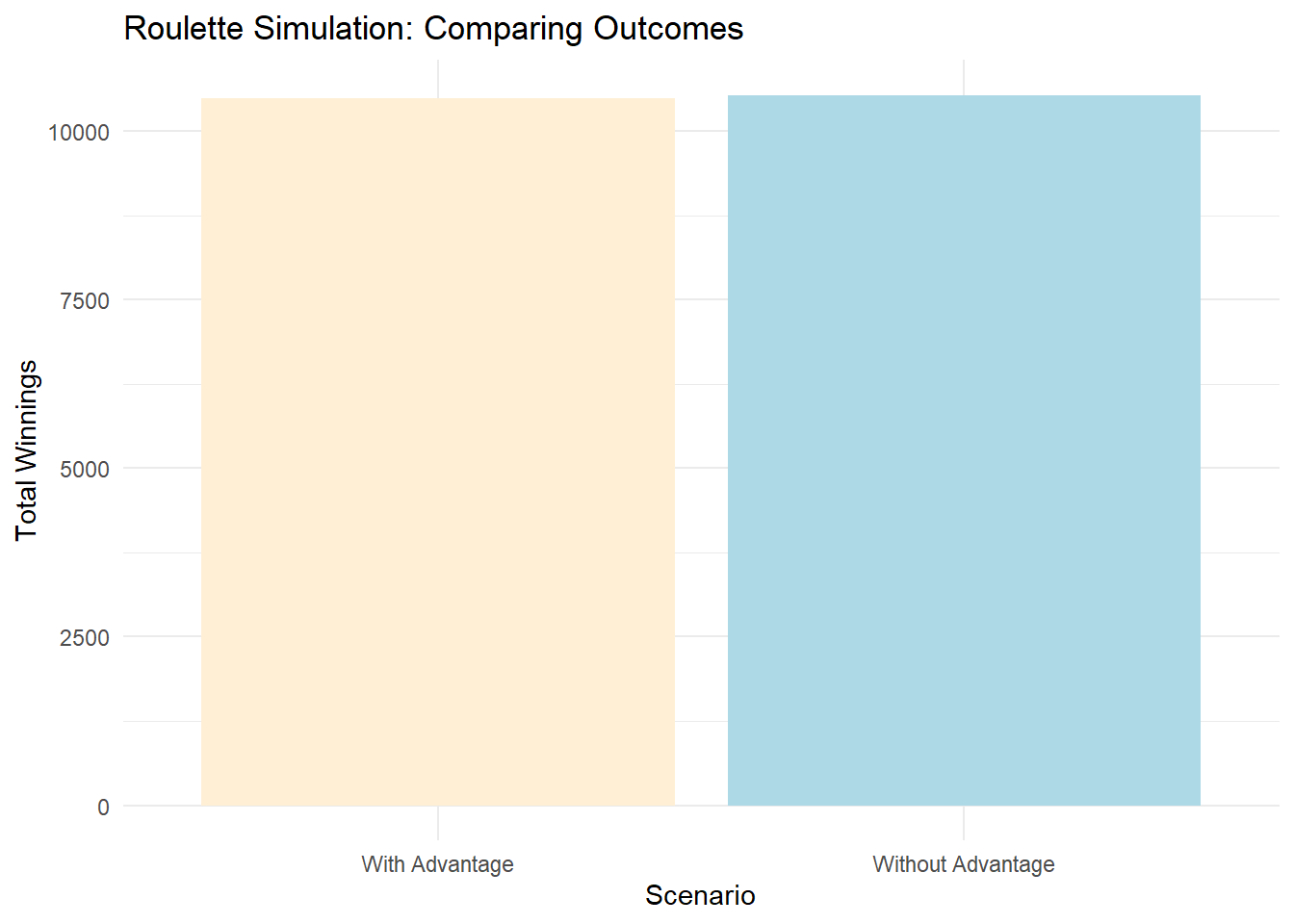
Have you ever wondered why casinos seem to have a mysterious edge, making them consistently profitable? Let’s explore a paradox in the world of gambling, where the number zero takes center stage and helps the house always come out on top. To illustrate this phenomenon, let’s simulate the game of roulette using the R programming language. We’ll focus on a simple bet: predicting whether the ball will land on red or black.

Pubblicato in Data & Molecule Bits
Autore Giorgio Luciano

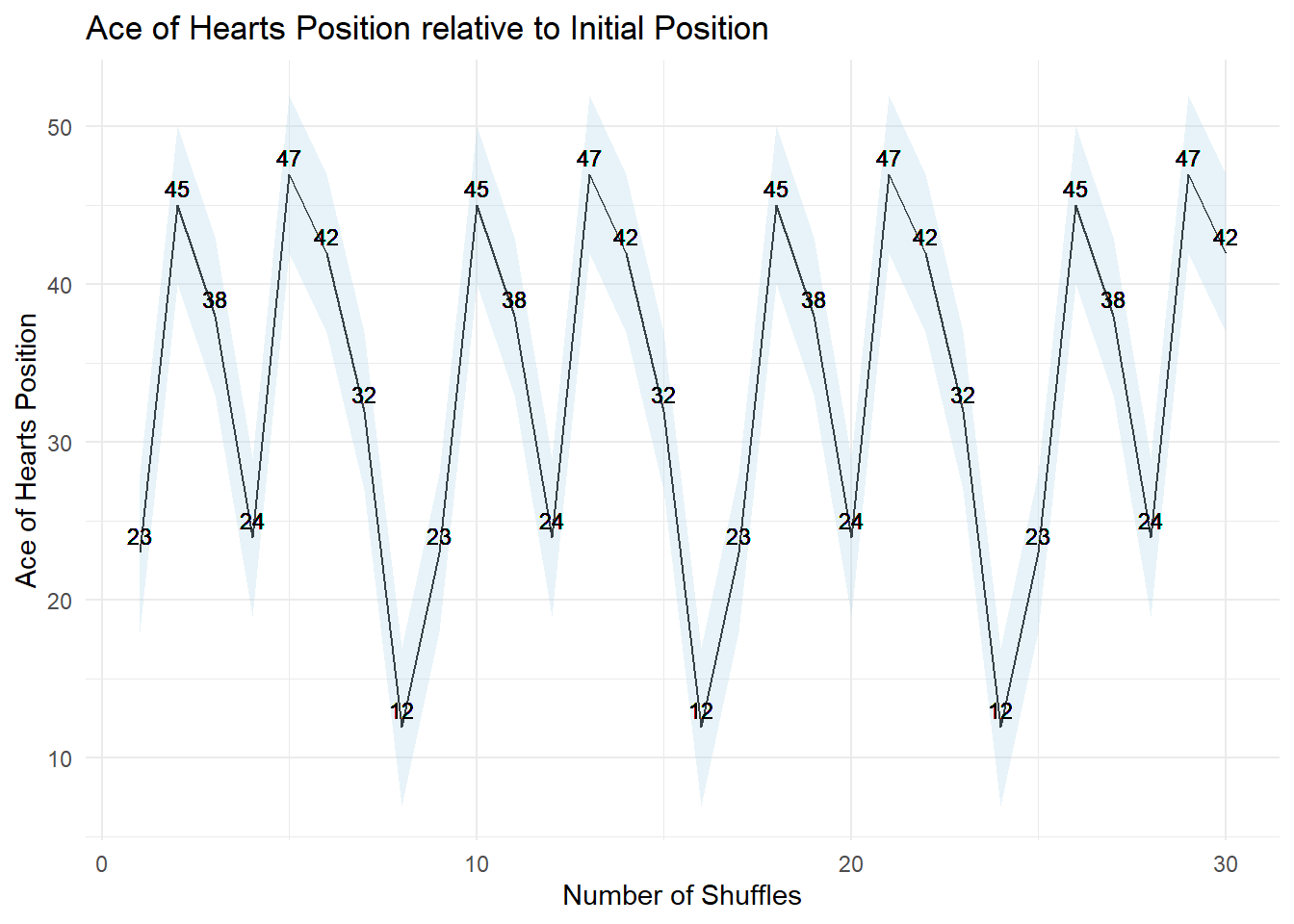
Today, we embark on a visual exploration of card shuffling, delving into a captivating technique known as the Faro shuffle. Unlike conventional shuffling, the Faro shuffle promises not just randomness but a mathematical symphony that unfolds card by card, a dance that echoes with the precision of numbers. In the quest to unravel the intricacies of card shuffling, we turn to the Faro shuffle, a technique that mimics the graceful dance of cards.

Pubblicato in quantixed

In a previous post, I looked at how Google Scholar ranks co-authors. While I had the data available I wondered whether paper authorship could be used in other ways. A few months back, John Cook posted about using Jaccard index and jazz albums. The idea is to look at the players on two jazz albums and examine the overlap.

Pubblicato in Data & Molecule Bits
Autore Giorgio Luciano

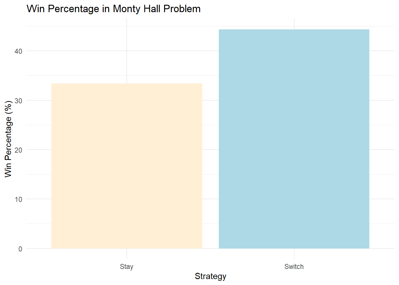
The Monty Hall problem is a famous probability puzzle. In this scenario, a contestant on a game show is presented with three doors. Behind one door, there is a car, while behind the other two, there are goats. The contestant chooses one door, and then the host, Monty Hall, who knows what is behind each door, opens one of the remaining two doors to reveal a goat.

Pubblicato in Data & Molecule Bits
Autore Giorgio Luciano

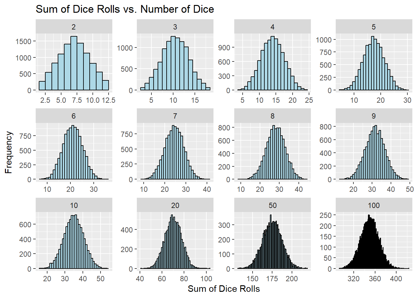
Dice rolling is a pastime enjoyed by many, whether in board games or games of chance. But have you ever wondered how the sum of multiple dice rolls behaves when you roll them repeatedly? In this blog post, we embark on a journey into the world of dice rolls and the fascinating Central Limit Theorem. We’ll uncover how the sum of dice rolls can transform into a Gaussian distribution as the number of rolls increases.

Pubblicato in Data & Molecule Bits
Autore Giorgio Luciano

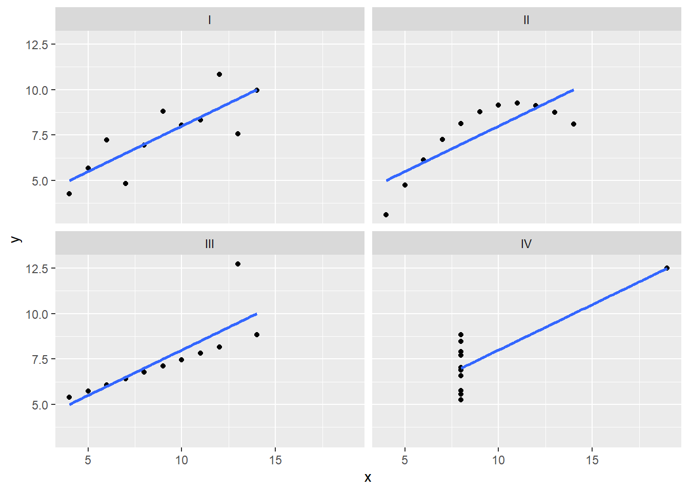
Anscombe’s Quartet, known as the “Anscombe’s Test,” consists of four datasets with very similar descriptive statistics but visually distinct characteristics. These quartets serve as an enlightening example of the importance of visualizing data before drawing conclusions. In this post, we will delve into how to calculate and visualize Anscombe’s Quartet using R and the powerful ggplot2 library.